24 Aug Kazan – C1 + C2. Rushed Notes & Tips
Posted at 20:24h
in Worldskills
Super rushed notes from the first two days of competition here in Kazan.
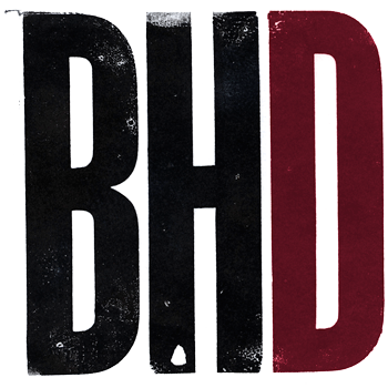
- Day 1 – Solid Art House Letterpress Printers rebrand for a great vintage press here in Kazan. Complete with a legendary Zilant; four colour PMS and themed with a constructivist style 8pp booklet and interactive PDF. Helped with measurement on several components with a thorough and fair team. However, a series of late nights, last buses and constantly, hopelessly confused on what day of the week it is makes catching up for a night cap with local friends almost impossible. Today’s tip = Know your design history. Know what makes up the constructivist style; understand letterpress limitations and gauges; pick timeless chunky typefaces that hold and press ink into thick cotten rag.
- Day 2 – Packaging for Mongolian Breathe Easy Cough Medicine, which is appropriate enough and contained Chinese and English components; free-style packaging with 3D mockups (which looked amazing lined up); labels and older, more homely target audience. Again, on measurement with some of the biggest names and heights on the expert crew – Finland, Barbados and Colombia aka as Team Velvet Sledge-hammers. Simple take away = Follow instructions exactly, EXACTLY. Text supplied, zero additions, requirements of logo placement and elements. These are the easiest marks to score. Competitors must double-down and score more of them!
A quick embed tonight of Adam Lucas’ images – He has captured the Kazan Expo site in the best possible light. His greatness appears below (embedded) courtesy of TAFE NSW.


