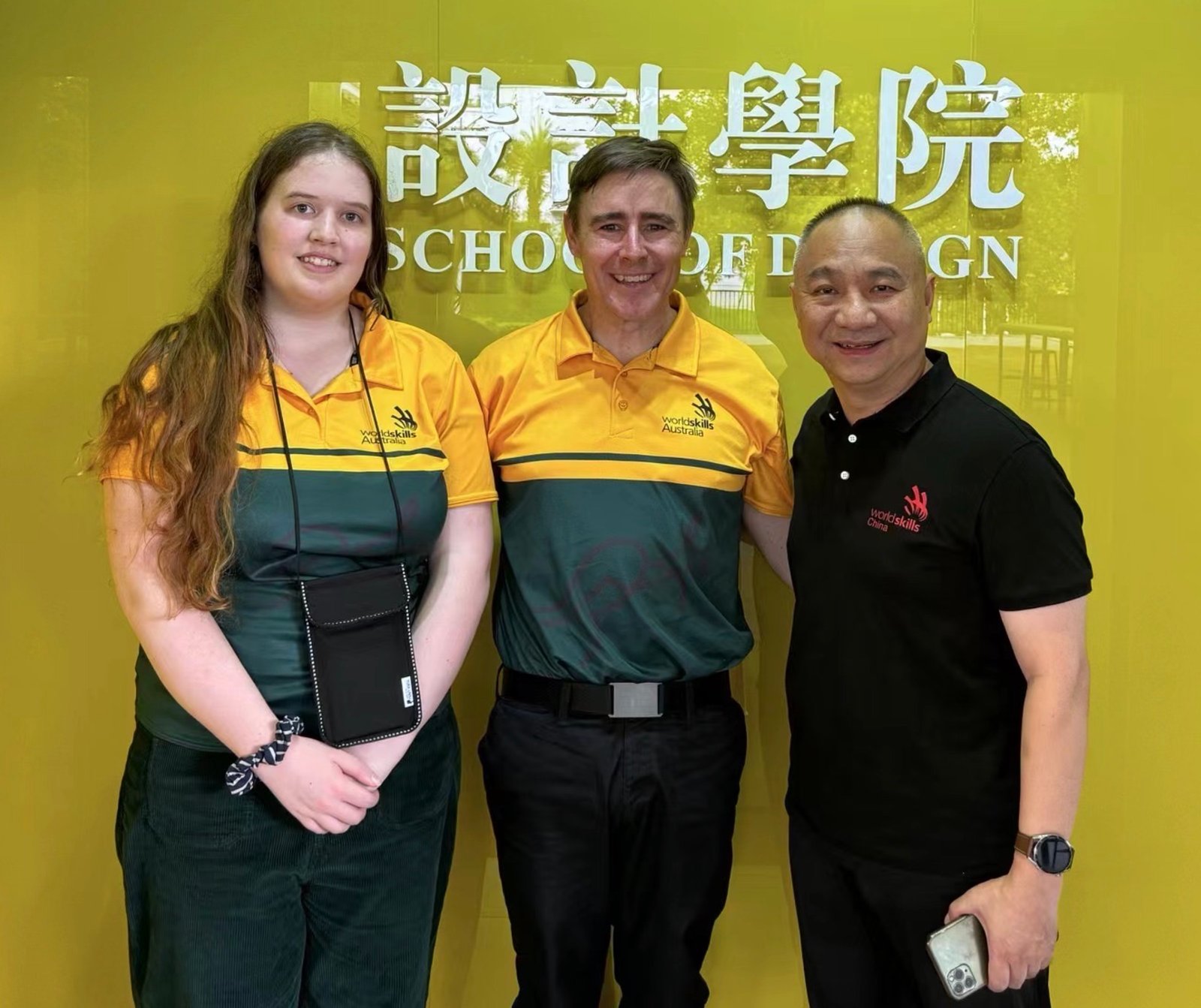
01 Jul Shenzhen School of Design hosts Worldskills Friendly
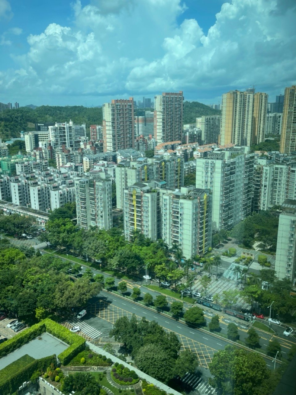
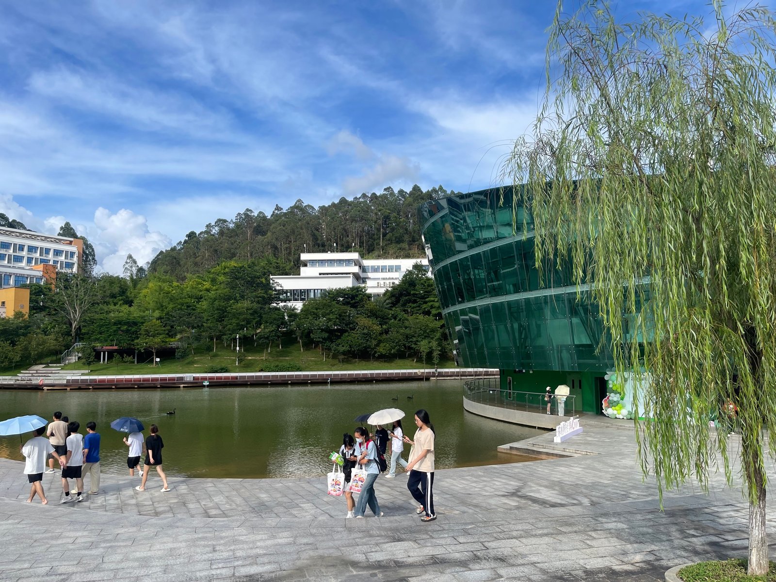
ARRIVAL, FAMILIARISATION & THE AMAZING COLLEGE SURROUND BY MOUNTAINS
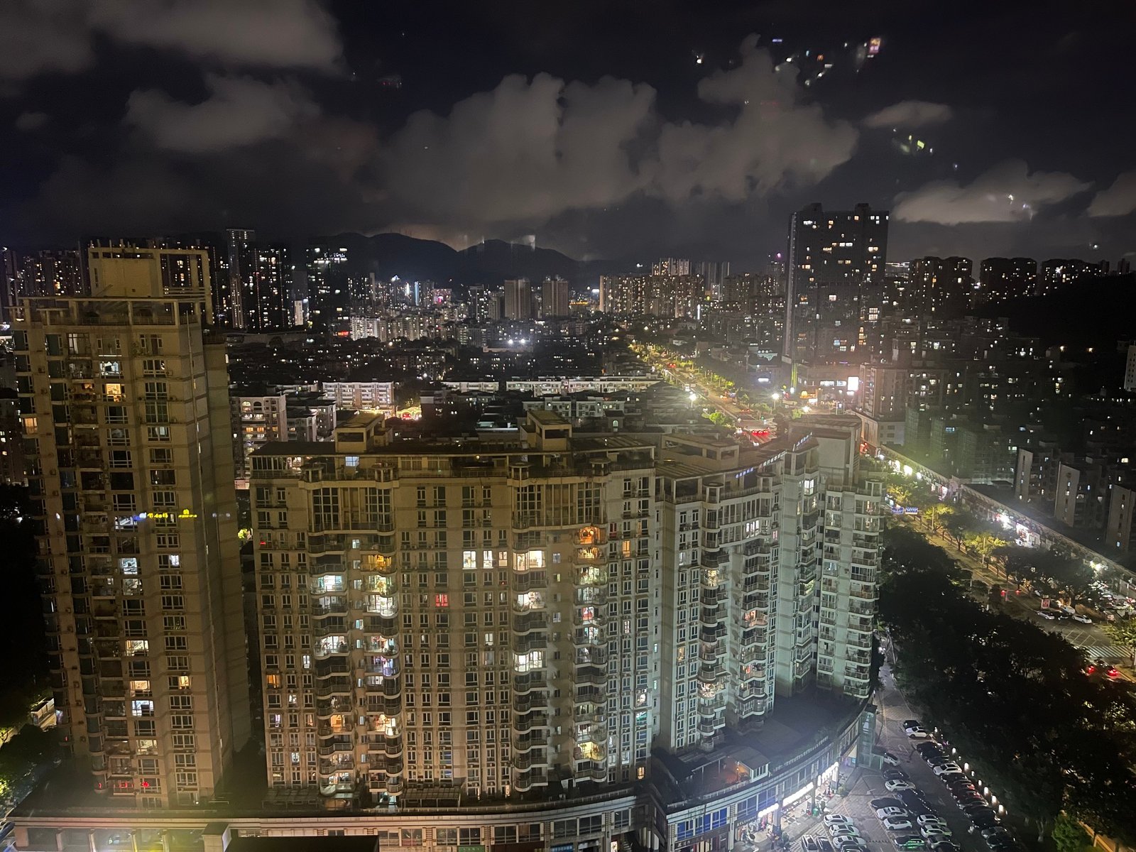
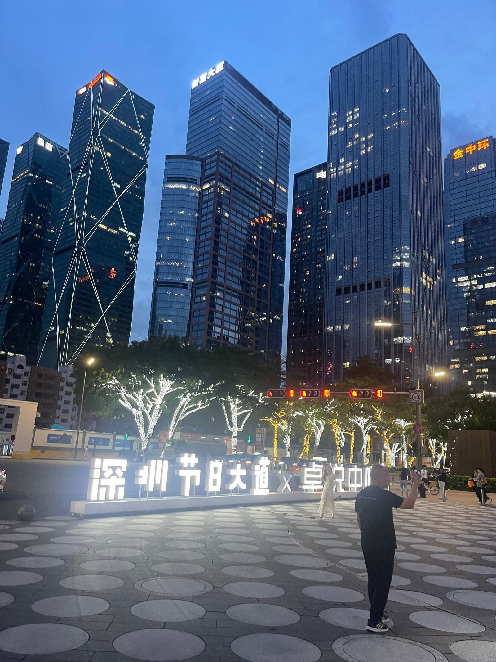
It is always a little dis-orientating landing in the dark at an unfamiliar airport. Get’s you turned around quick — and always dependent on the way the wind is blowing.
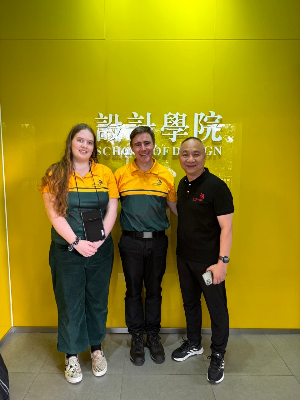
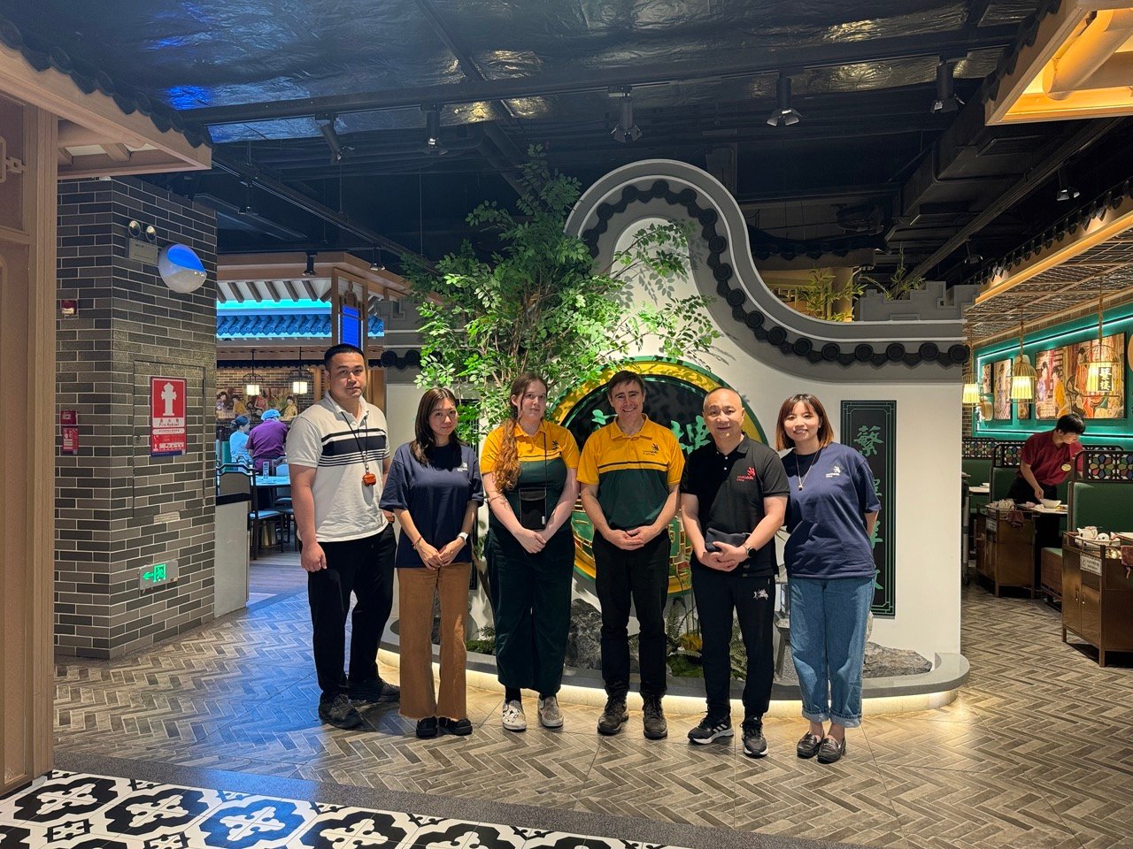
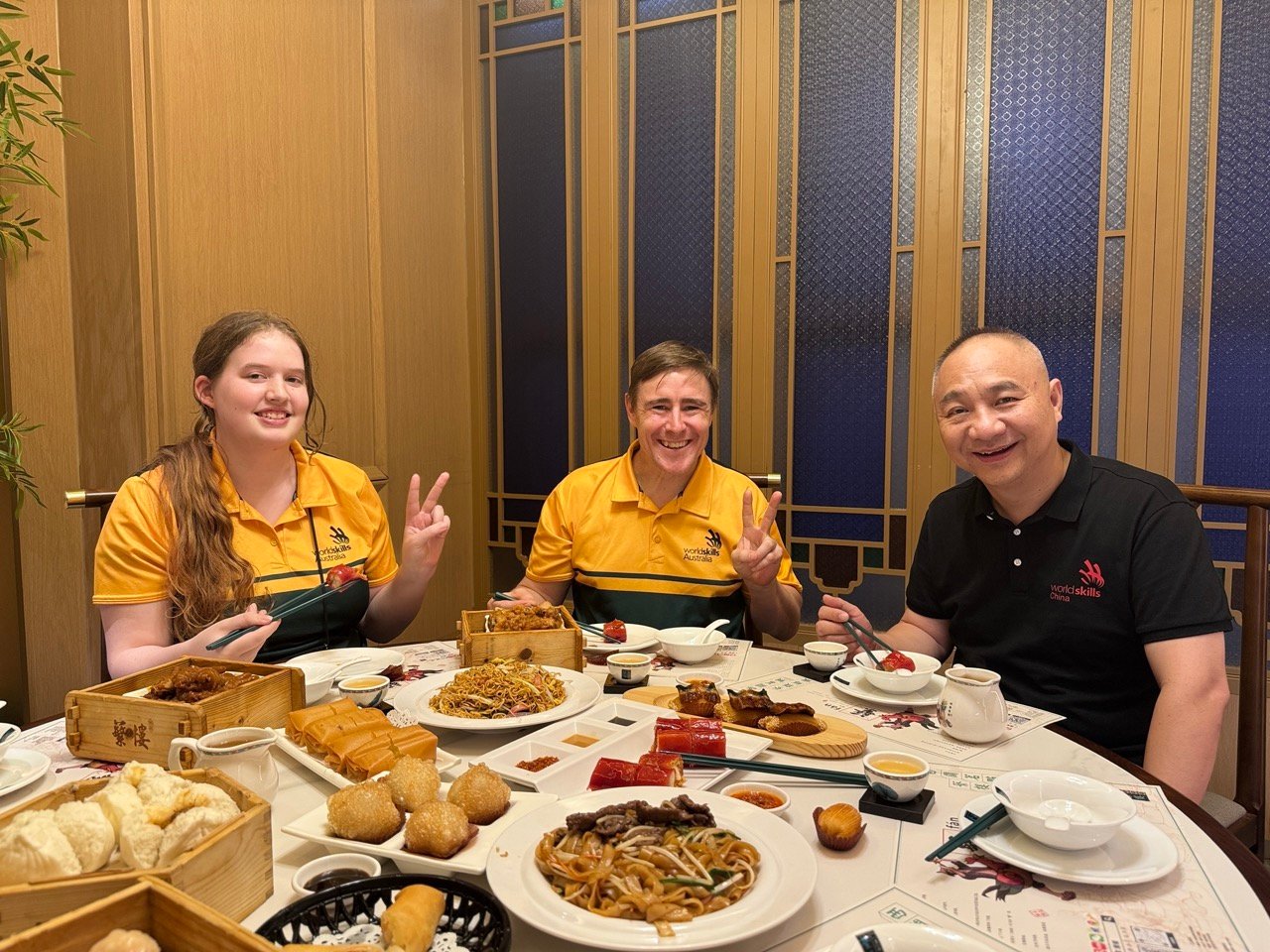
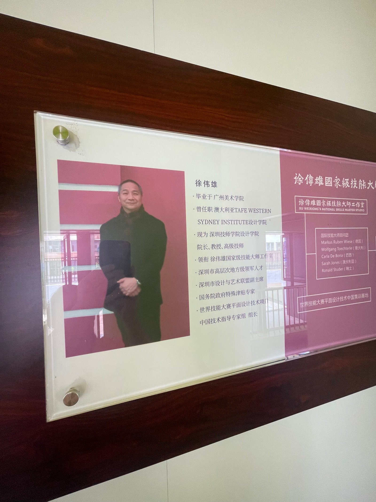
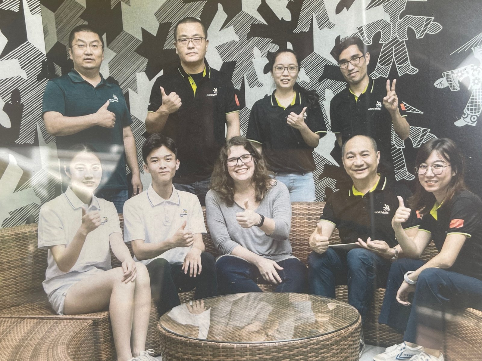
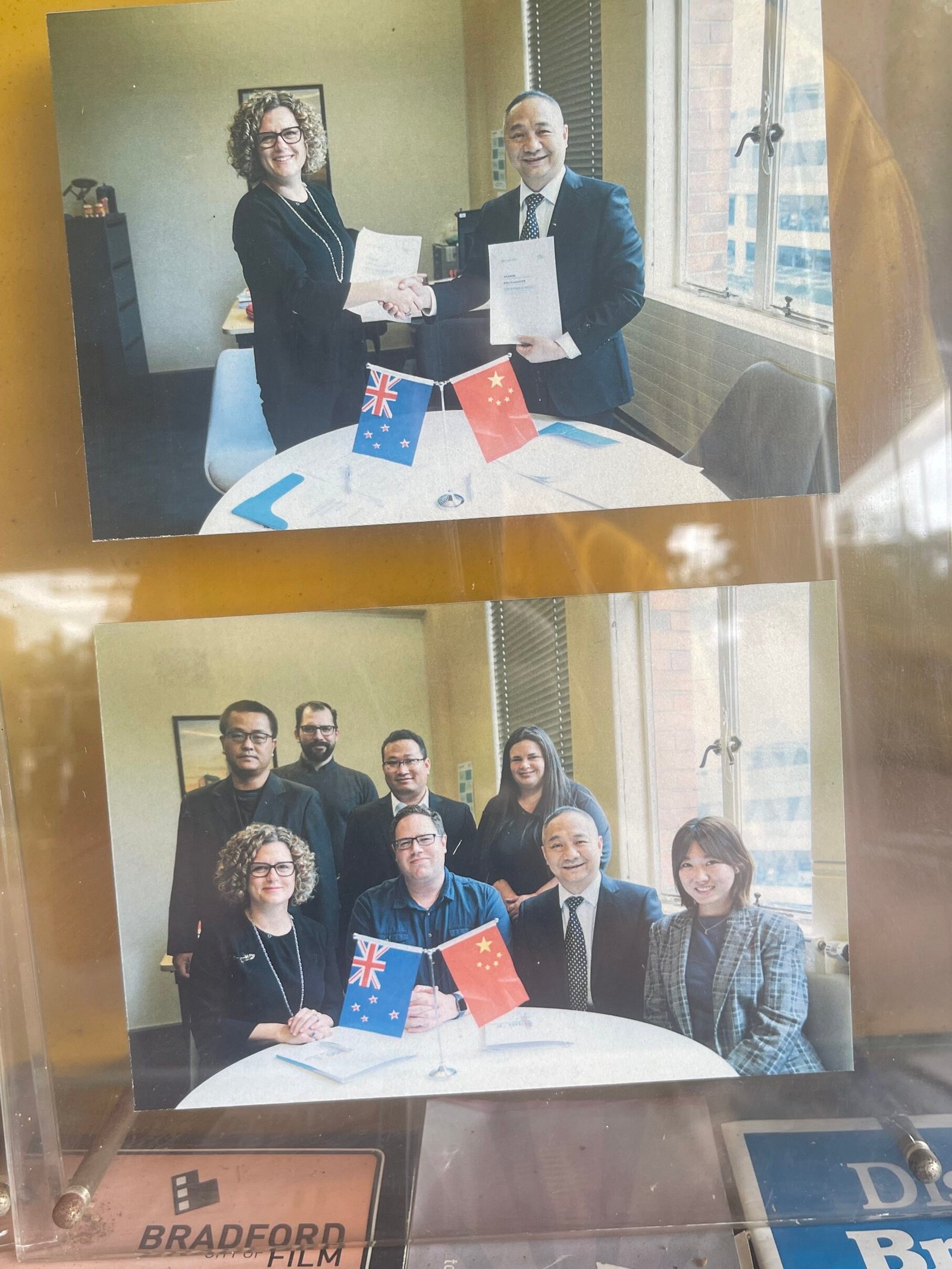
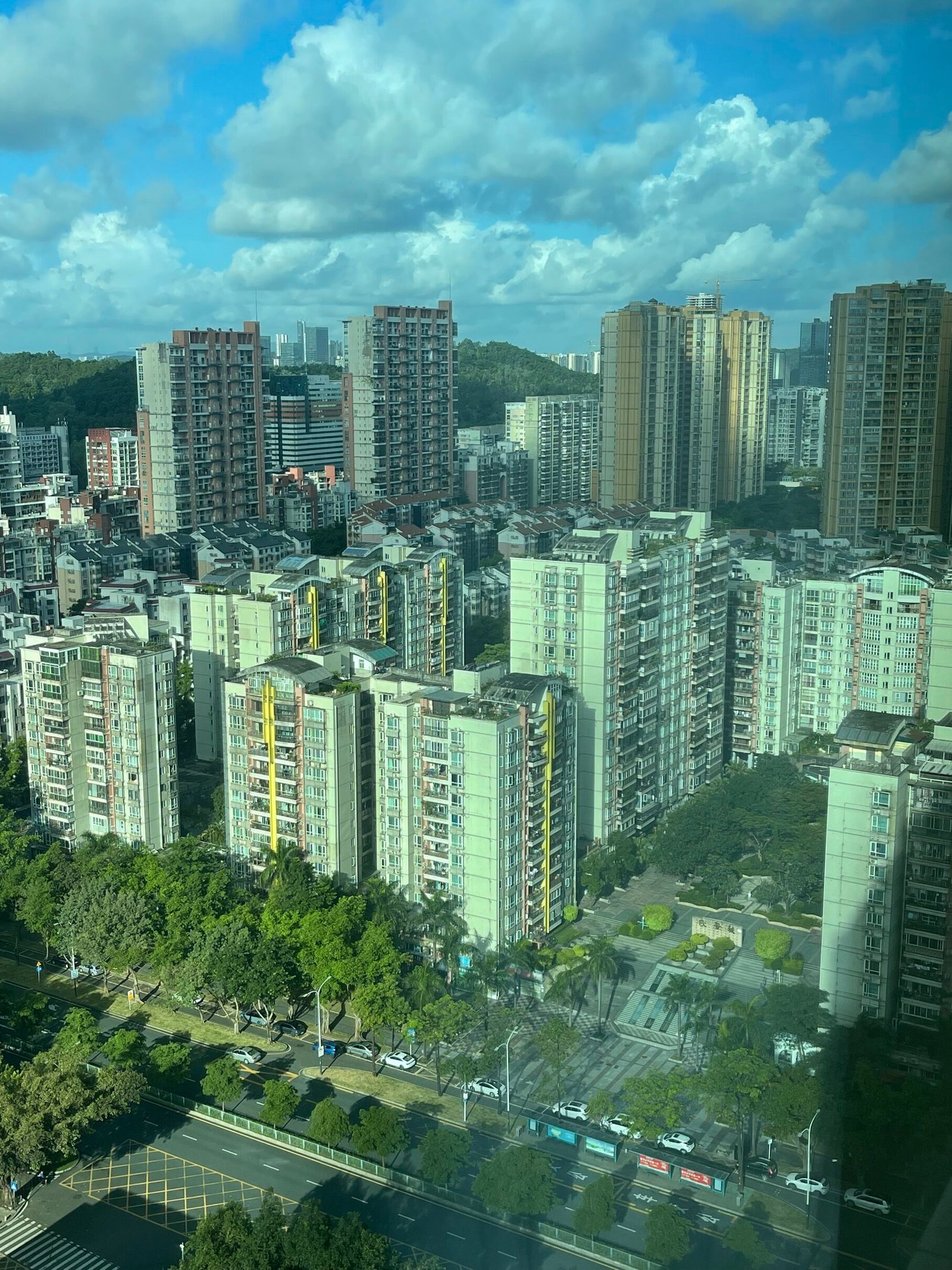
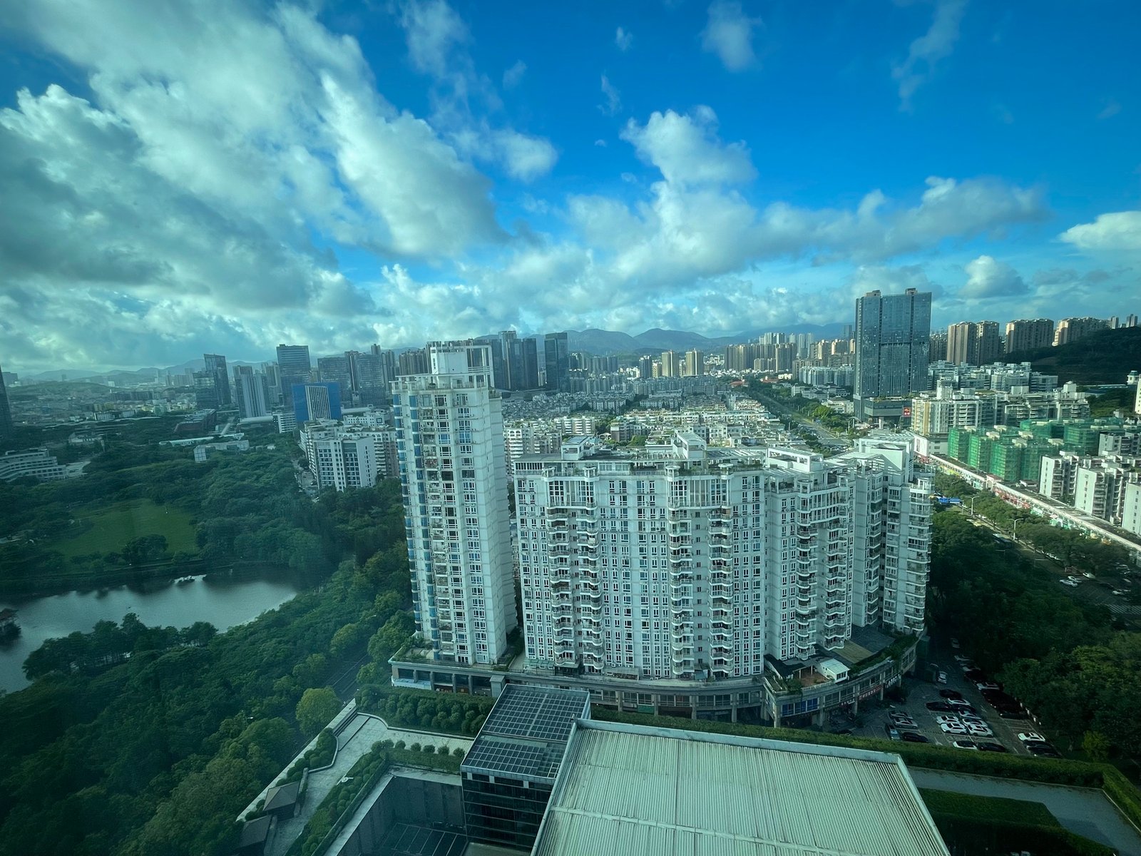
Nevertheless, having a great series of drivers, guides and translators helps make this transition into a comfortable arrival and both Nellie and myself quickly settled. No photos, but a big thanks to Orion and Sherry for holding up signs in the airport (who doesn’t love that!); driving us a hour to the hotel and ferrying us around this massive urban centre of eleven combined cities (with as many people in Australia); and Li Sha, Rose, Peter, Jackson and of course our dedicated Worldskills host, Weixiong Xu (Wilson).
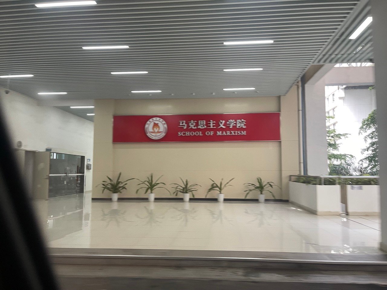
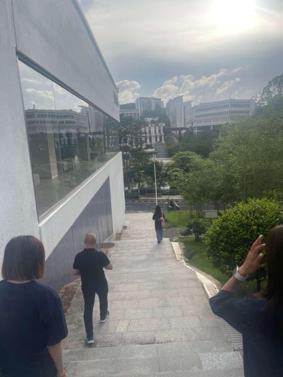
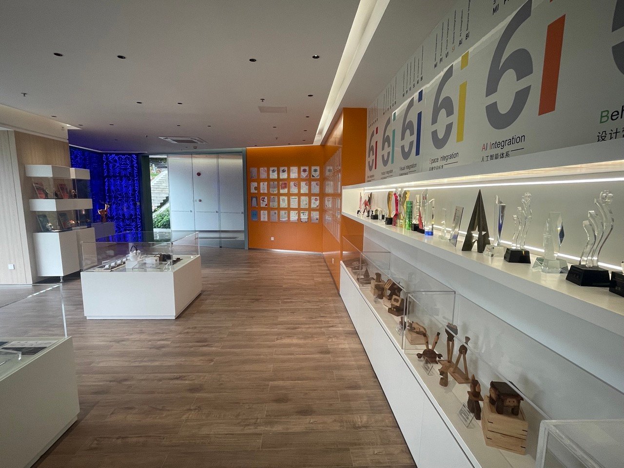
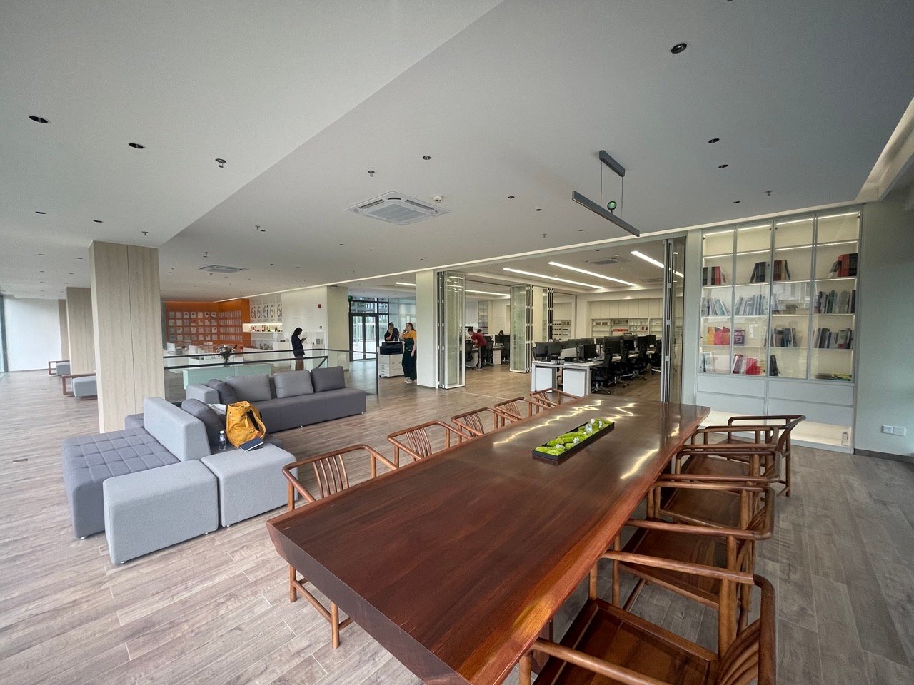
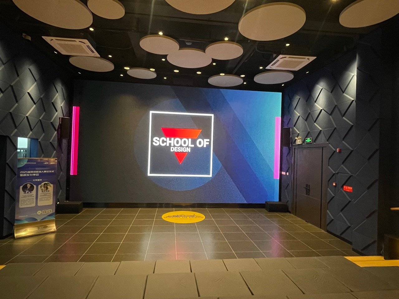
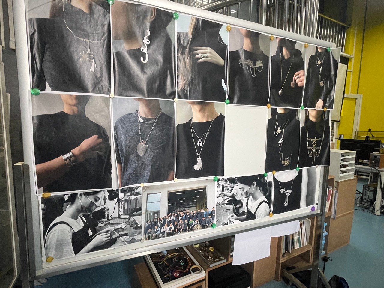
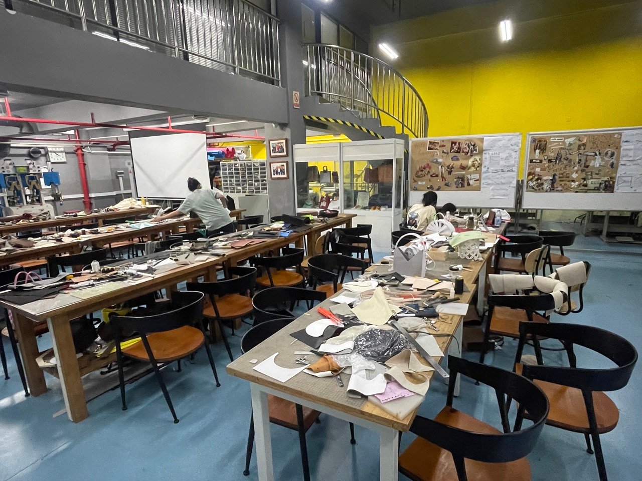
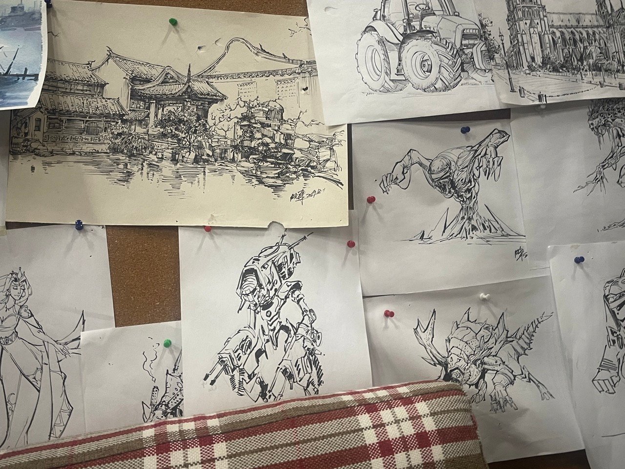
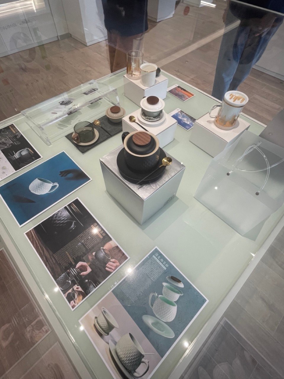
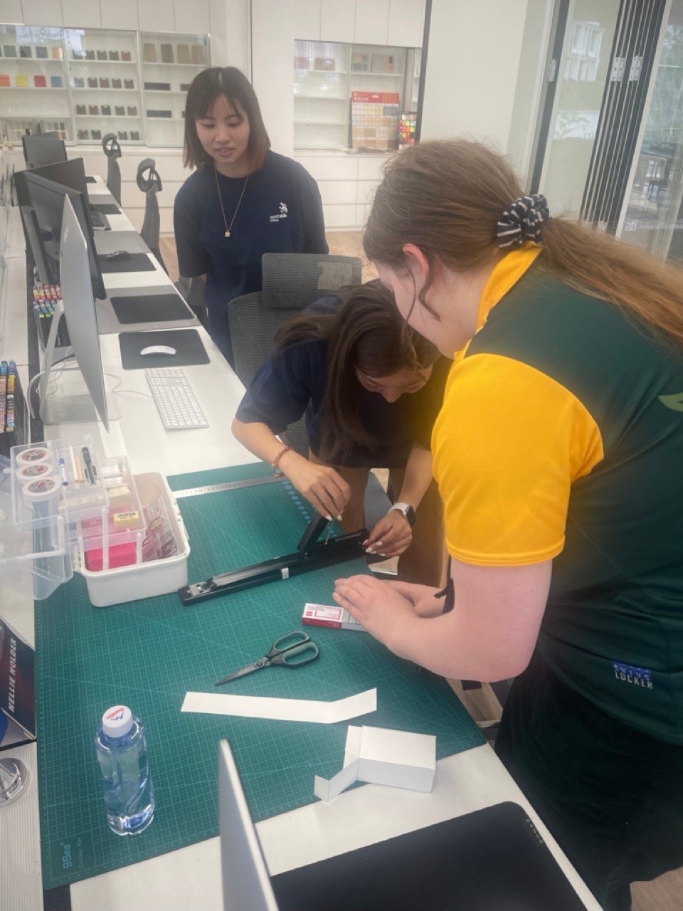
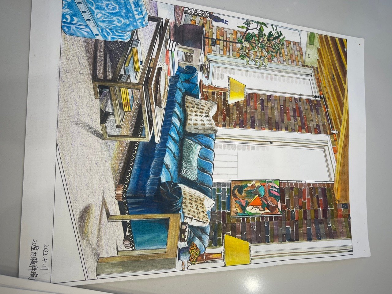
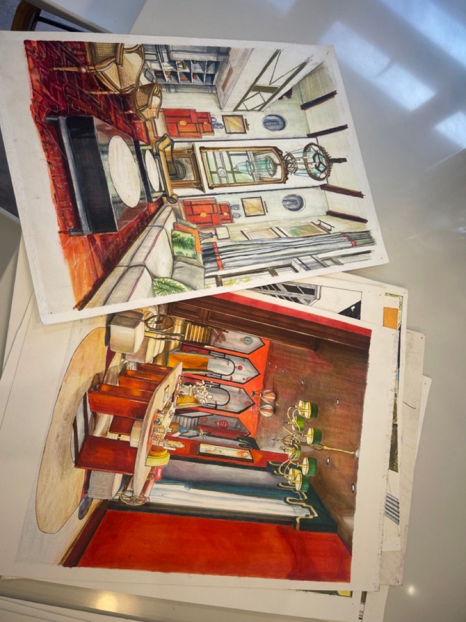
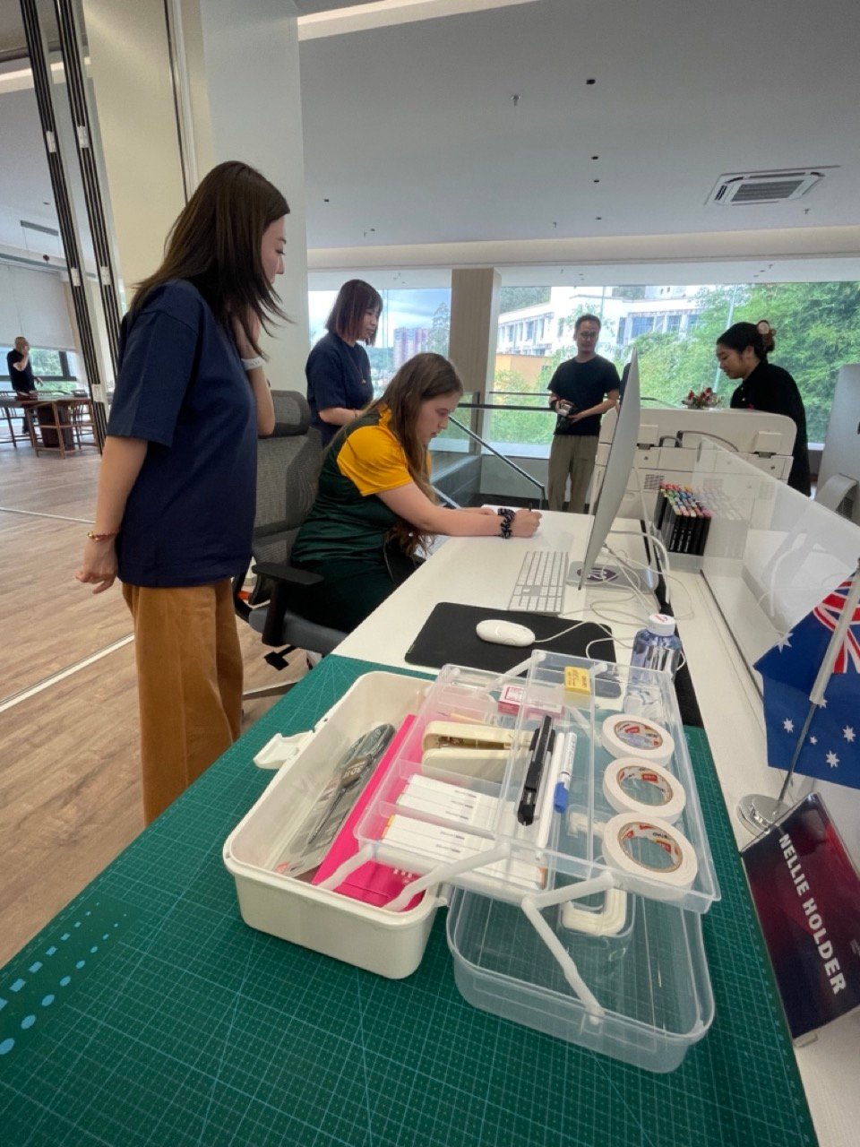
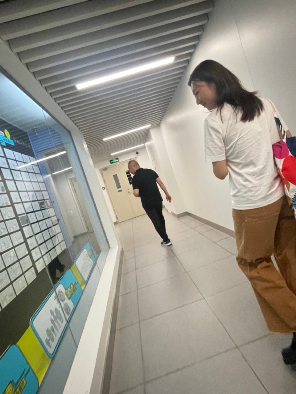
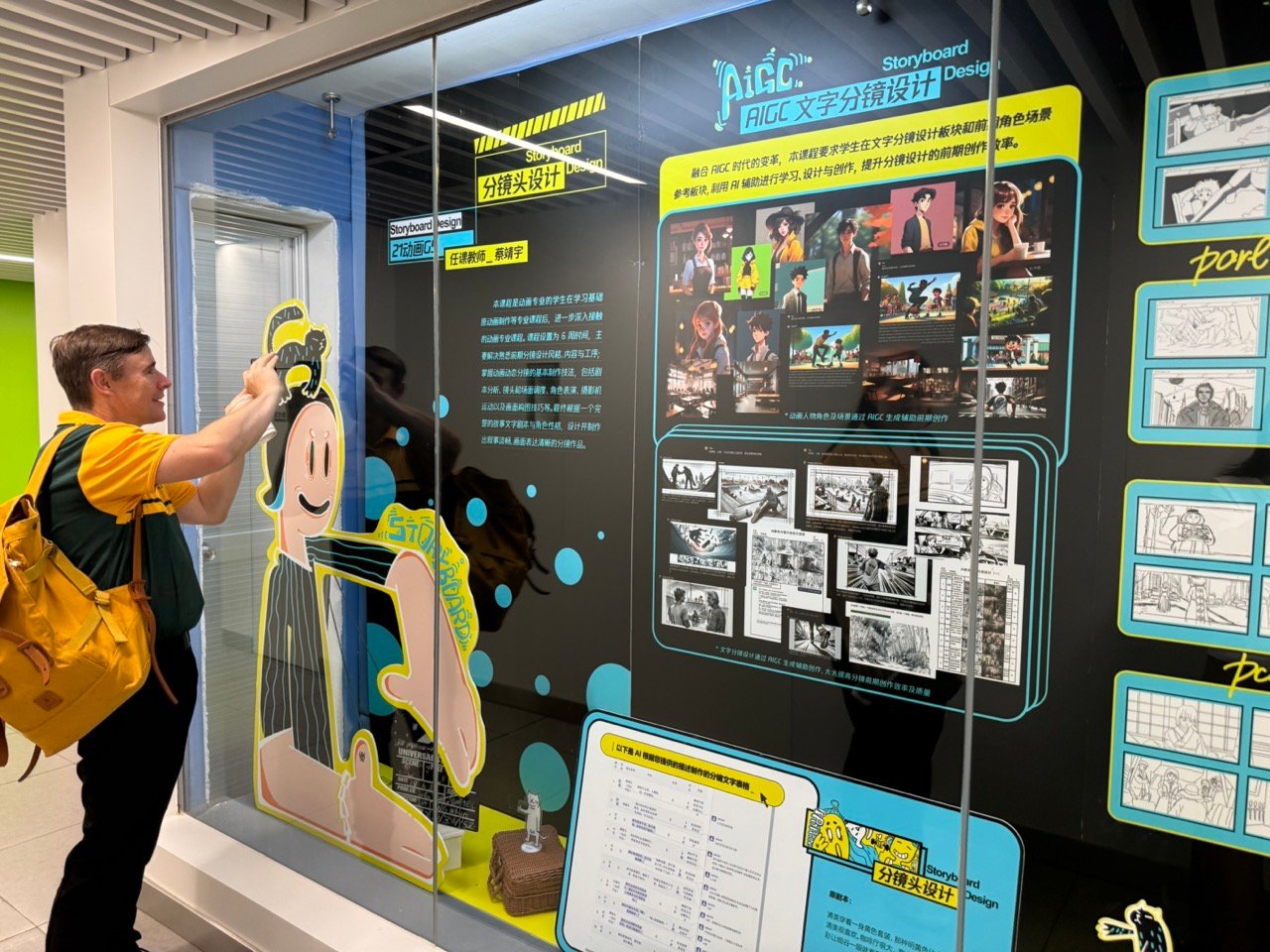
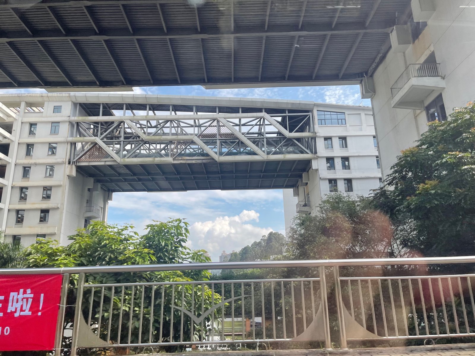
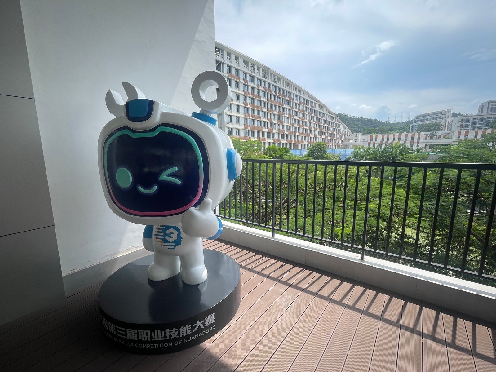
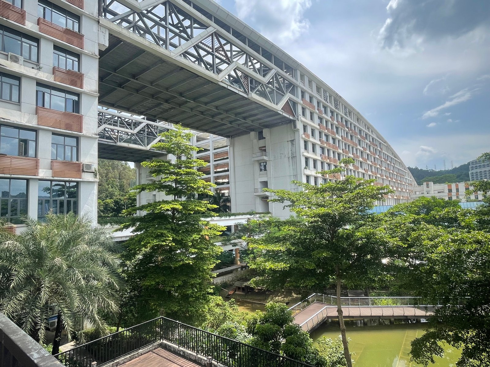
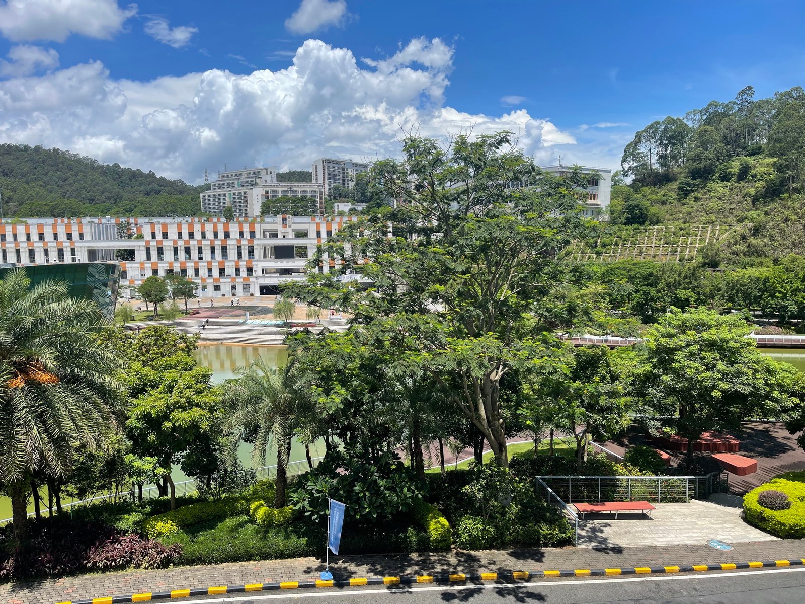
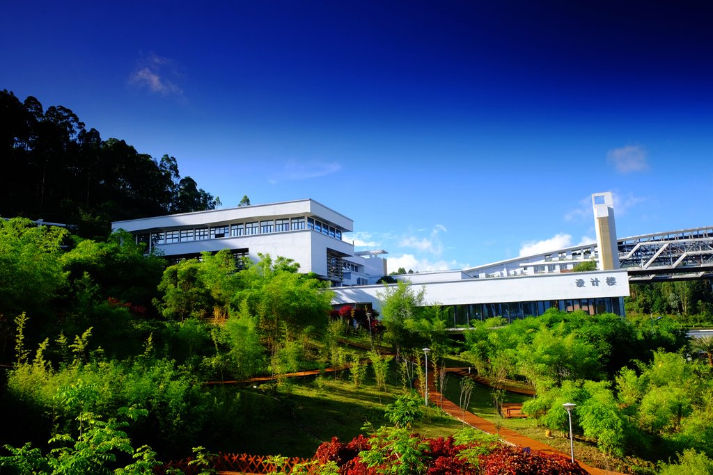
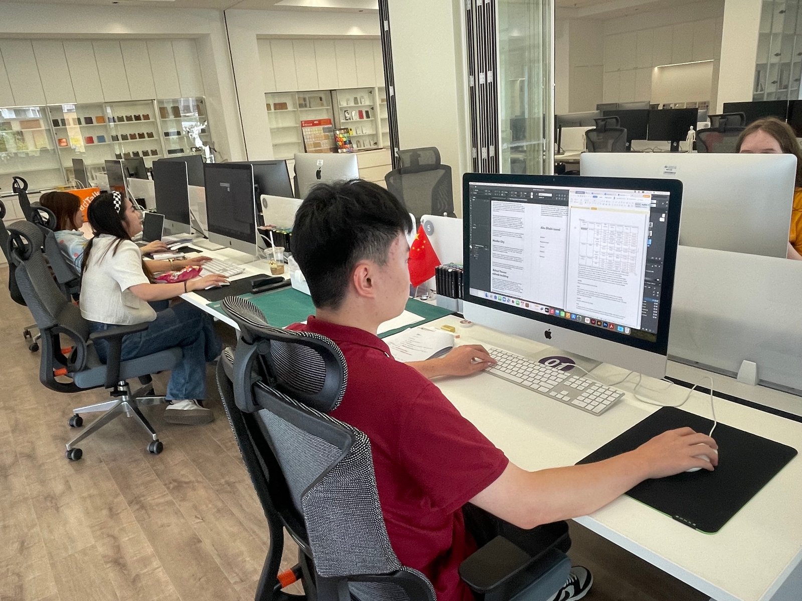
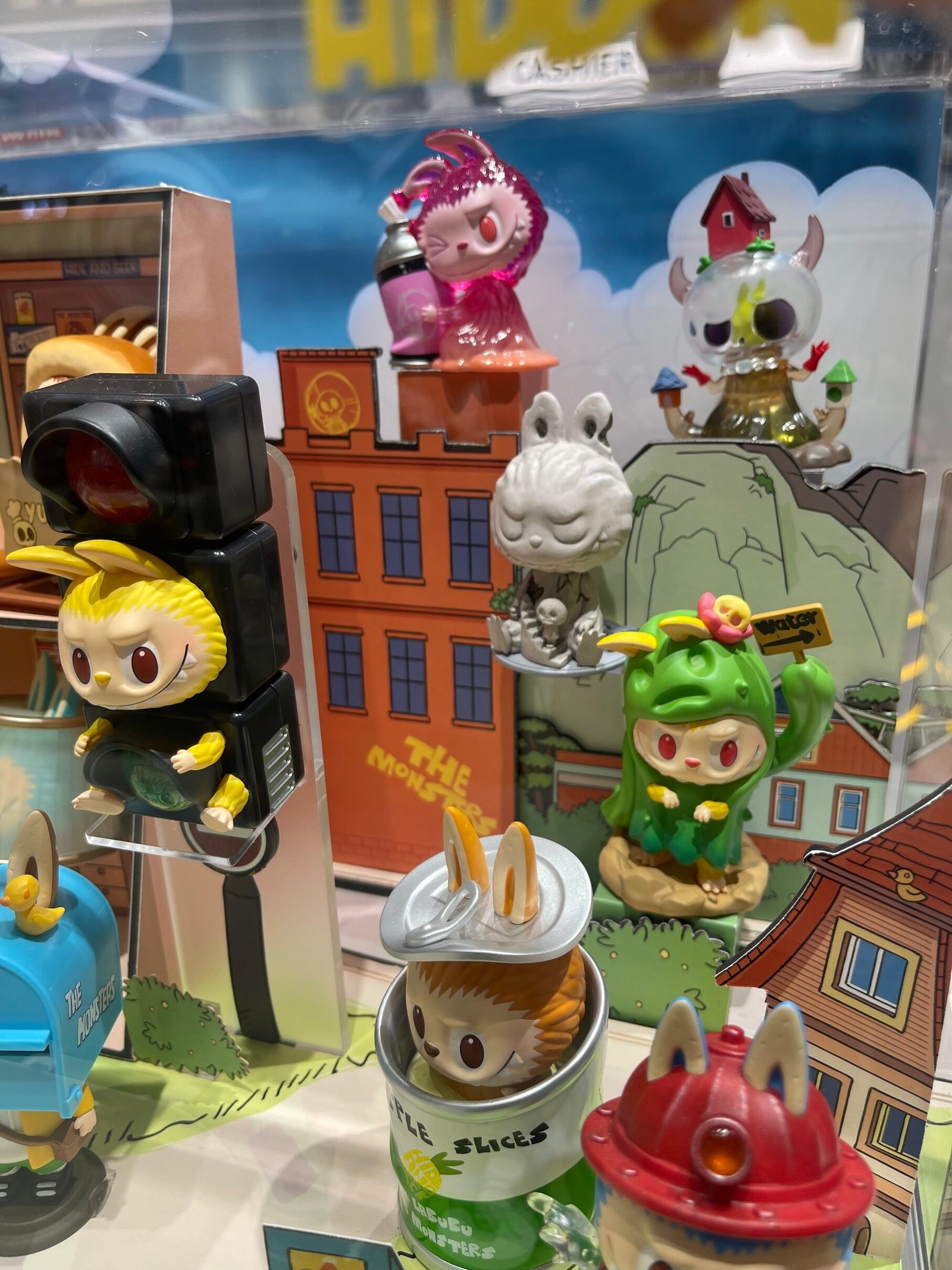
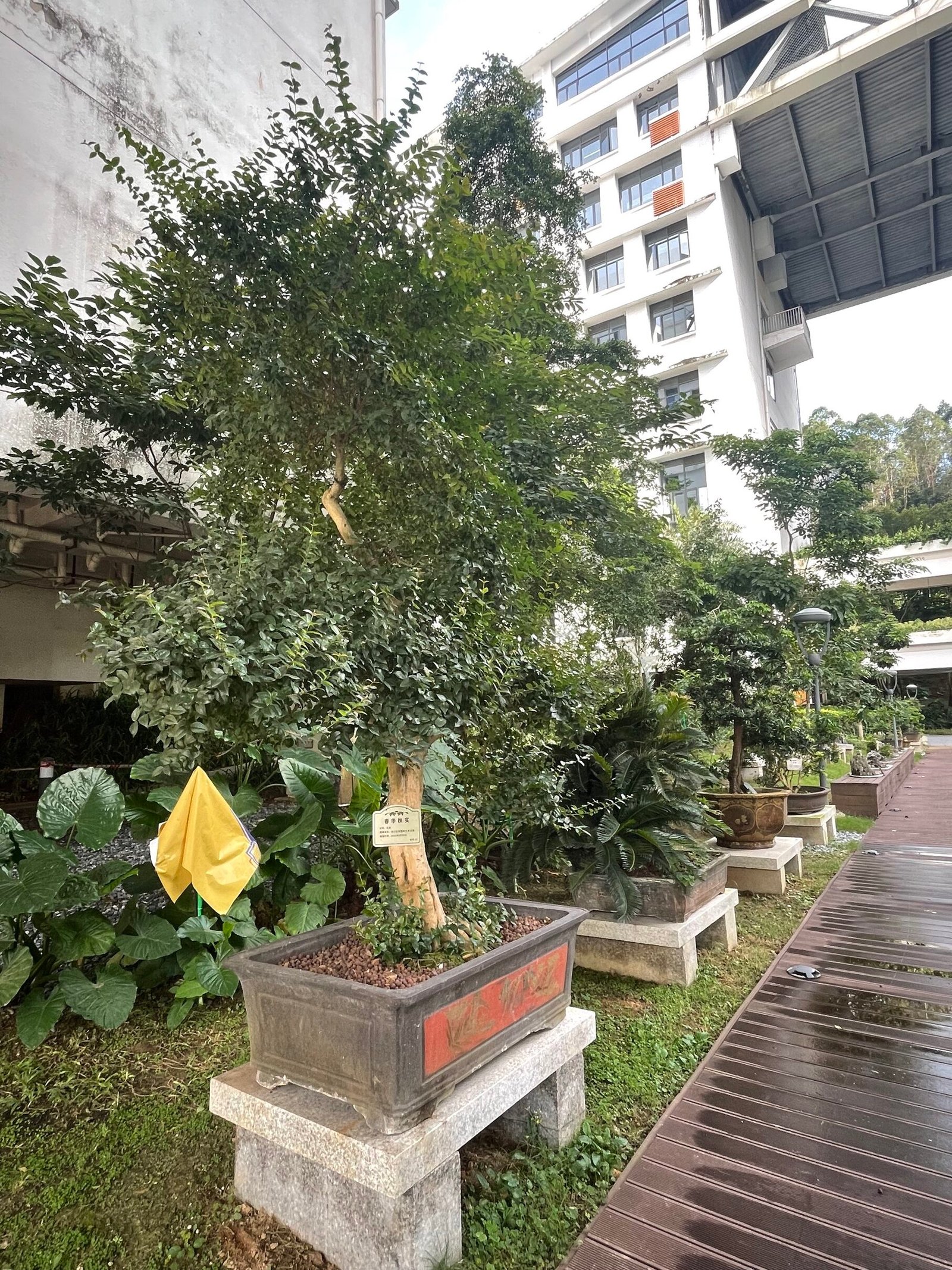
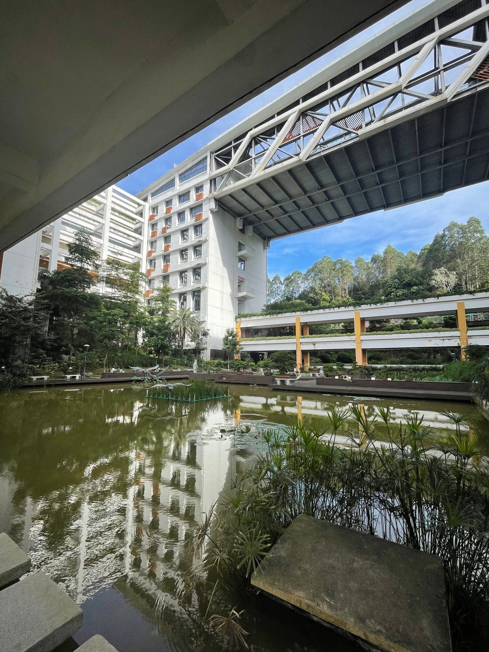
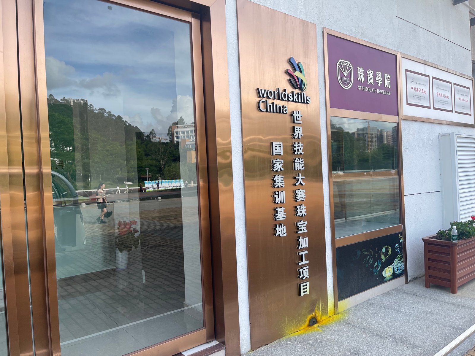
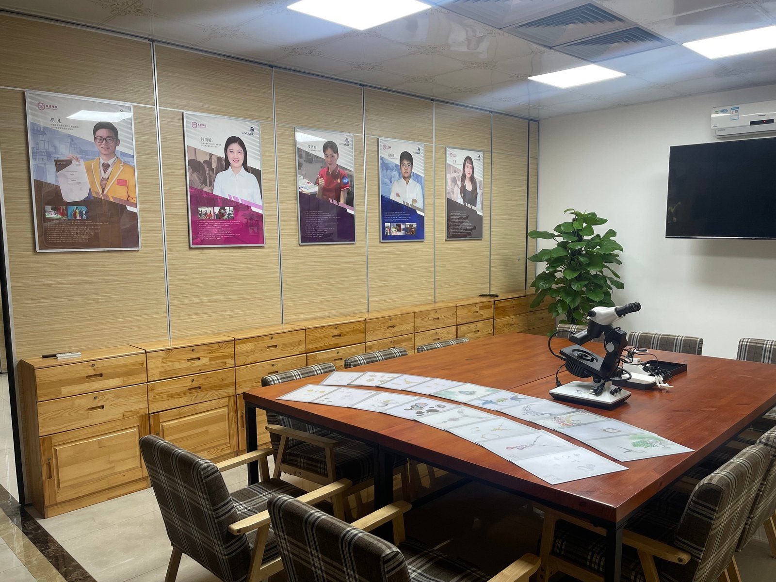
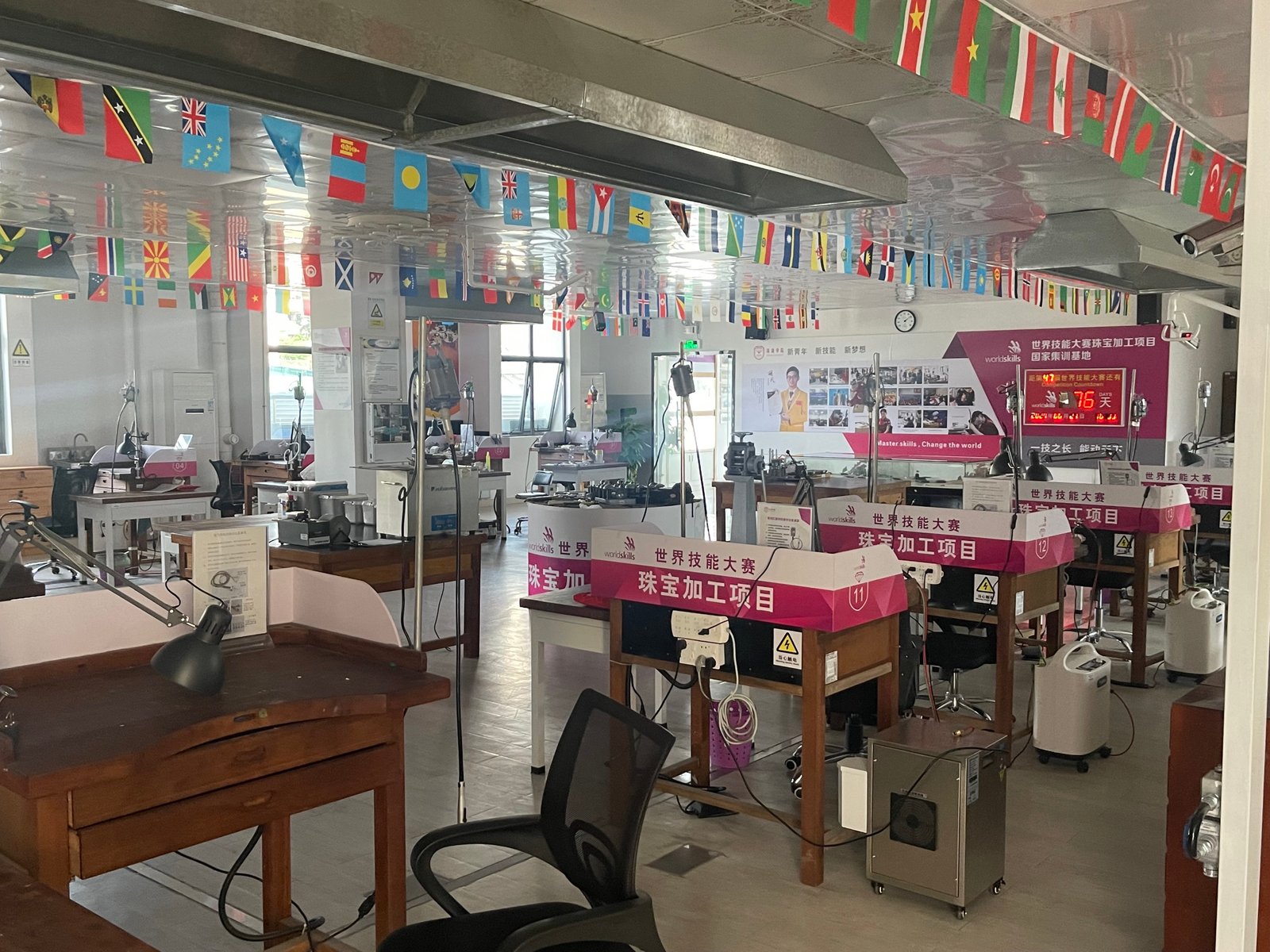
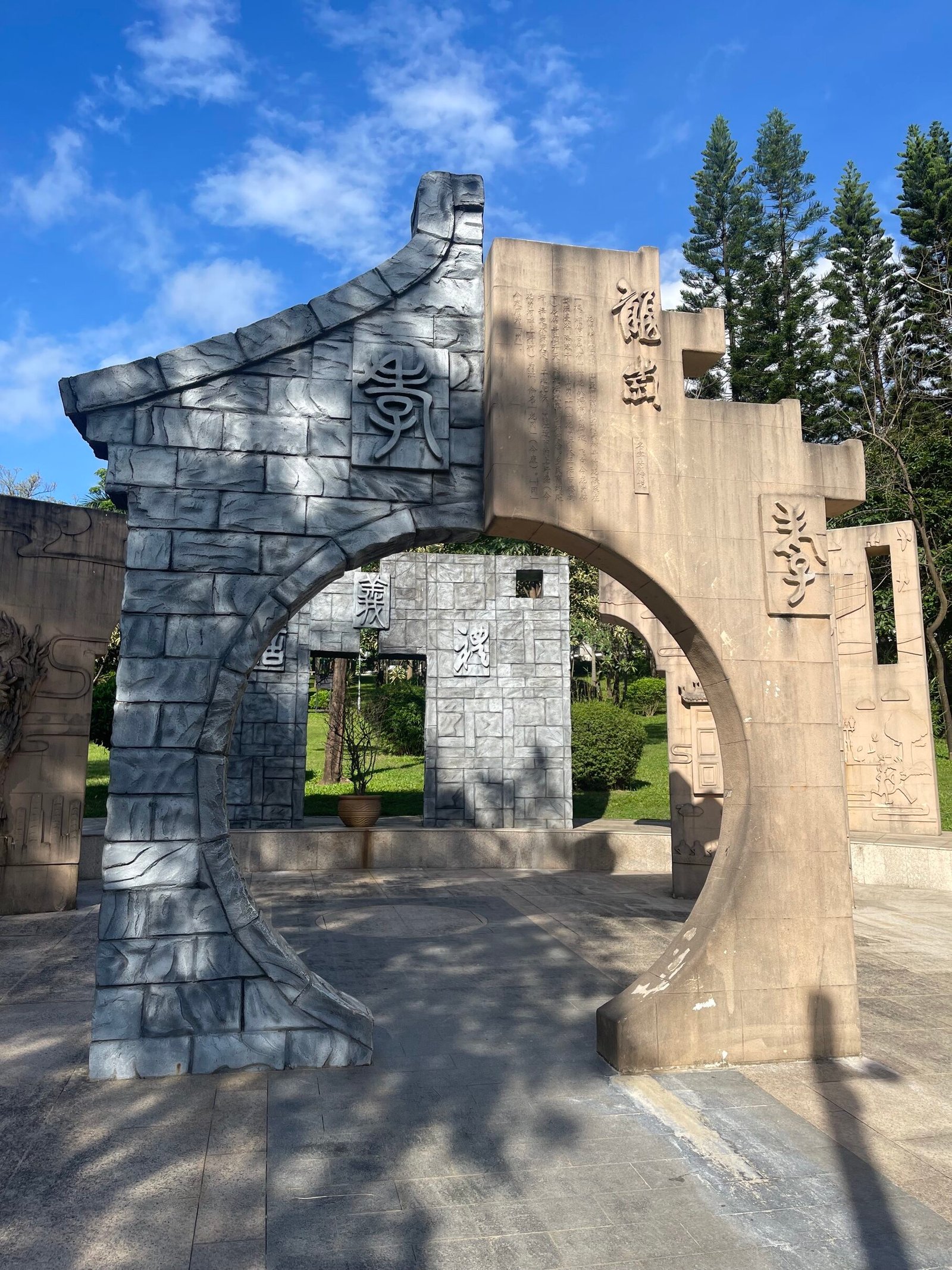
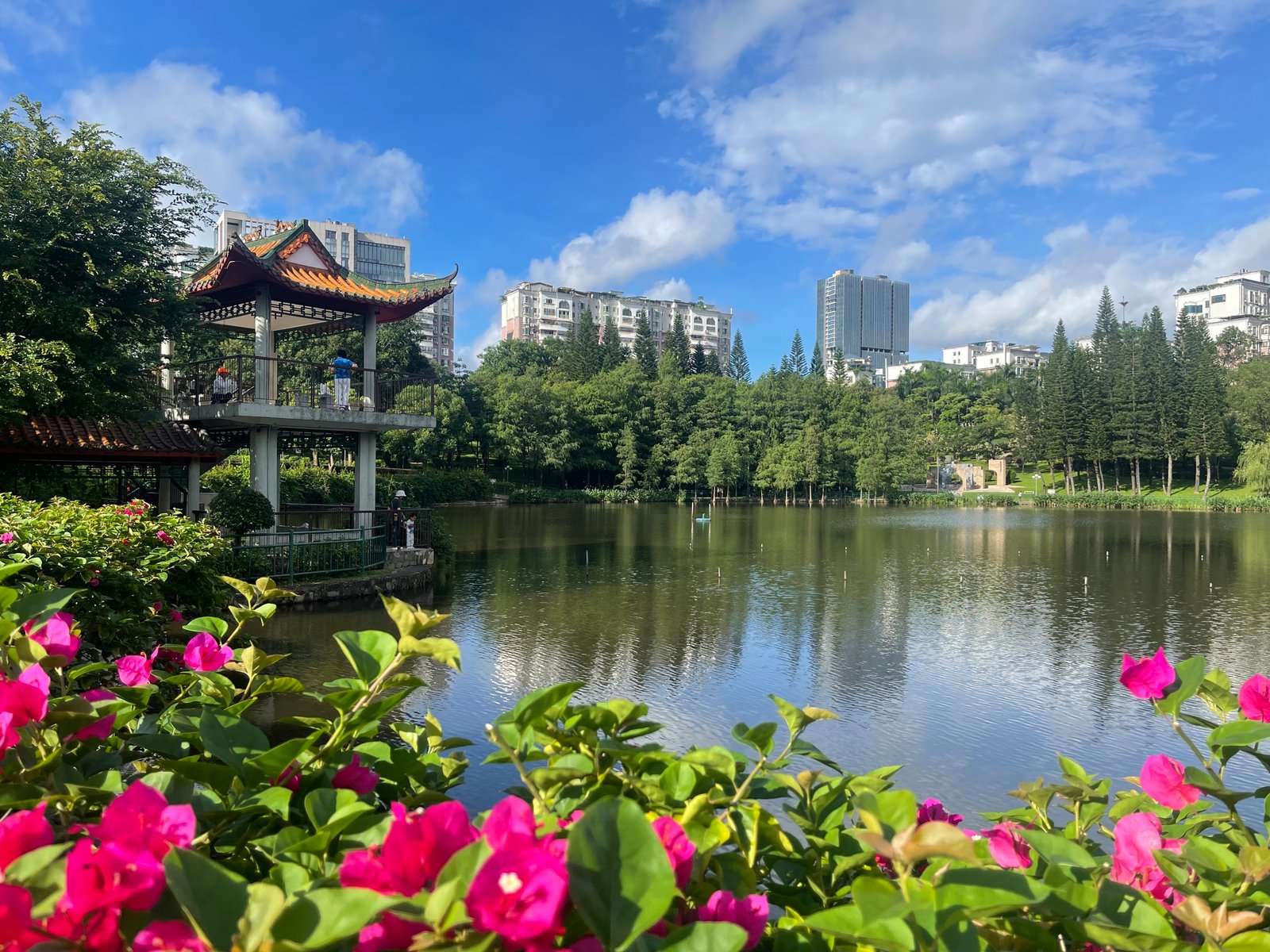
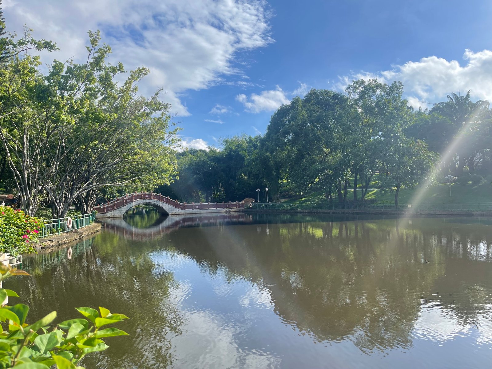
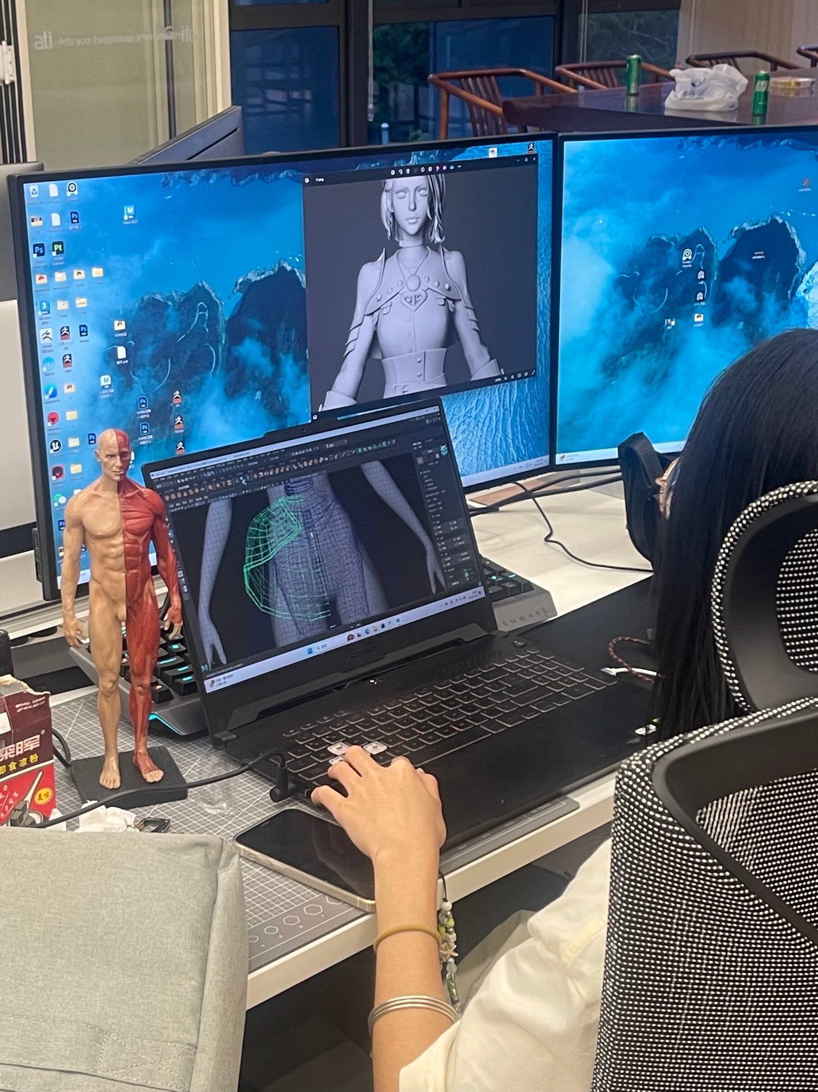
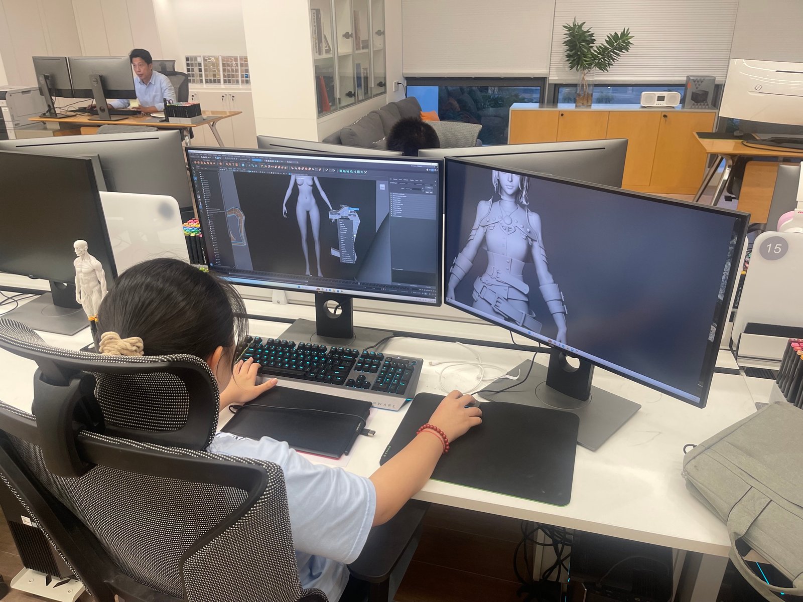
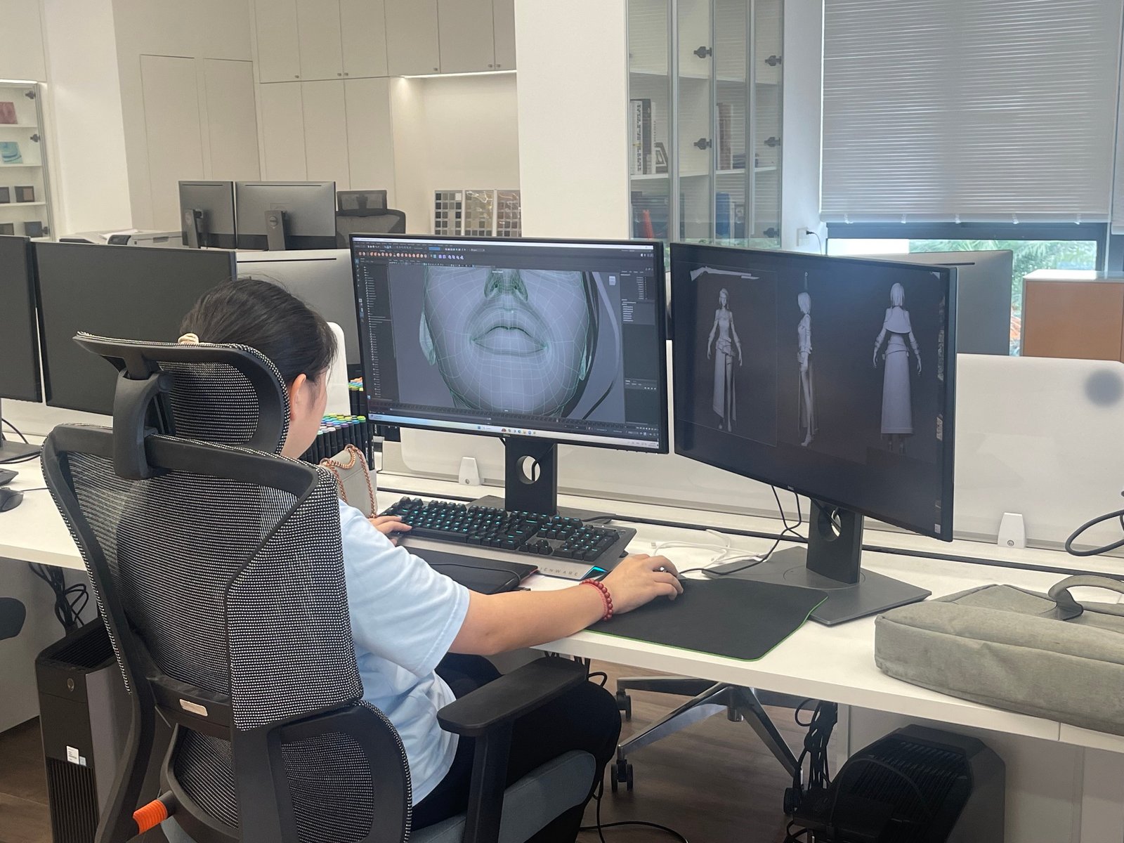
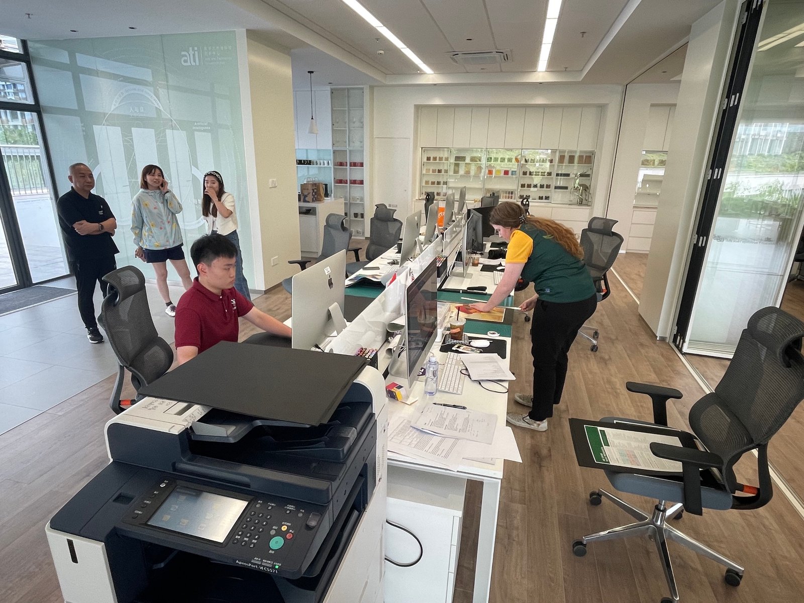
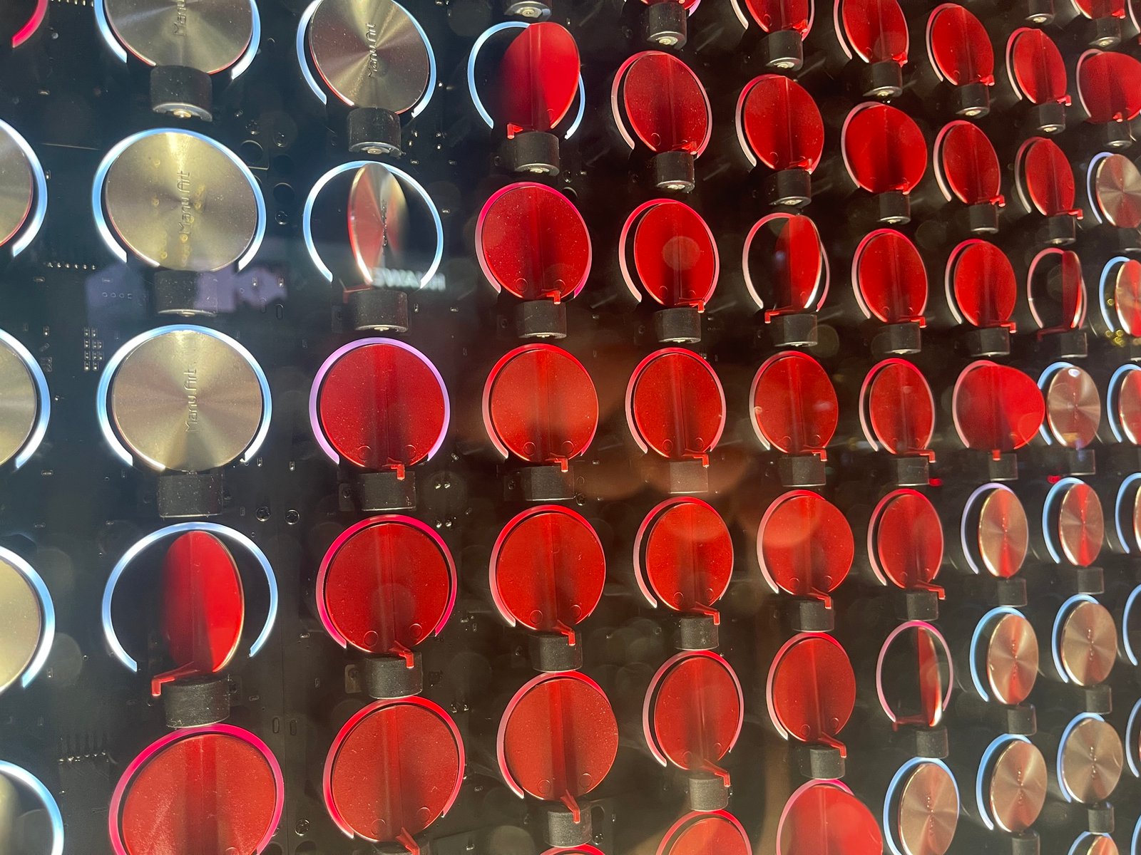
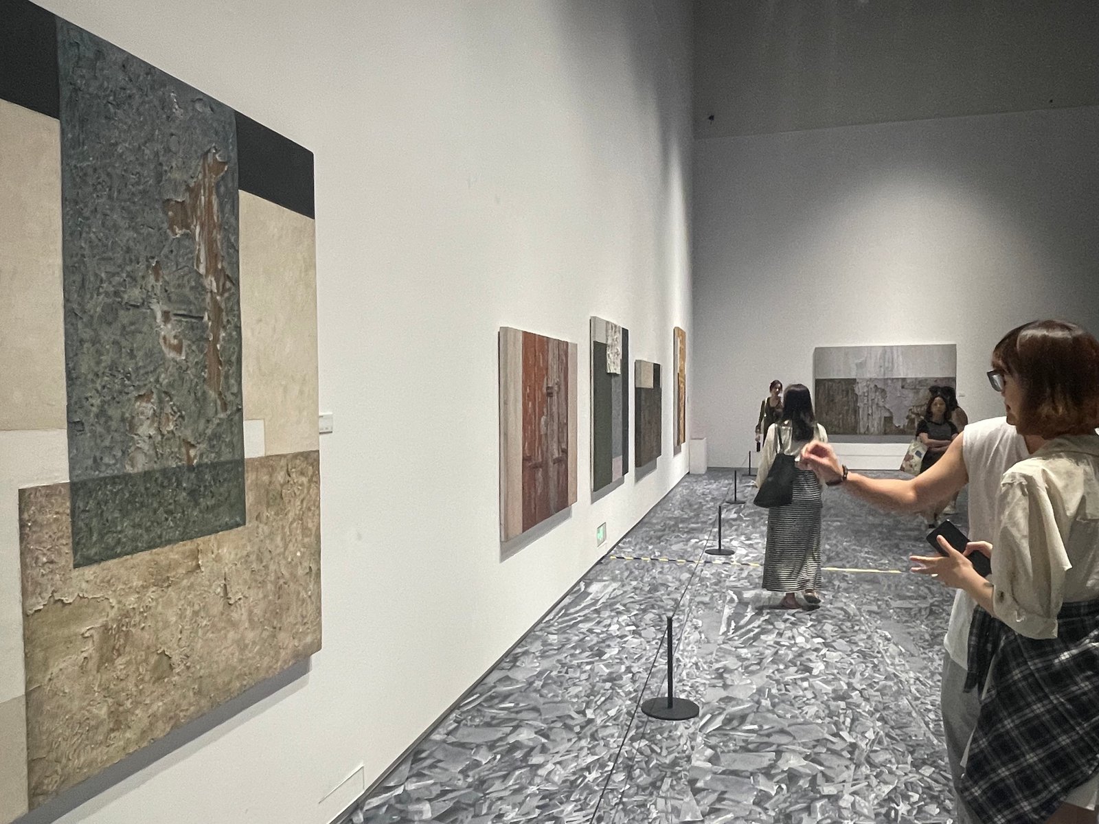
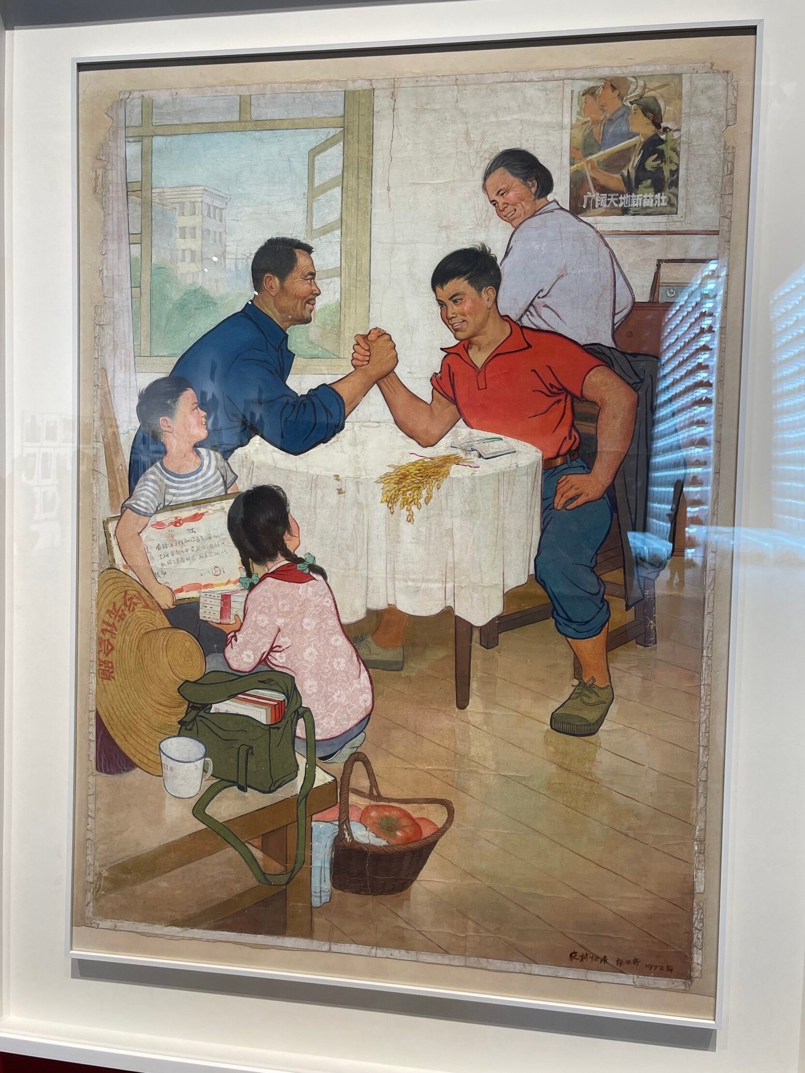
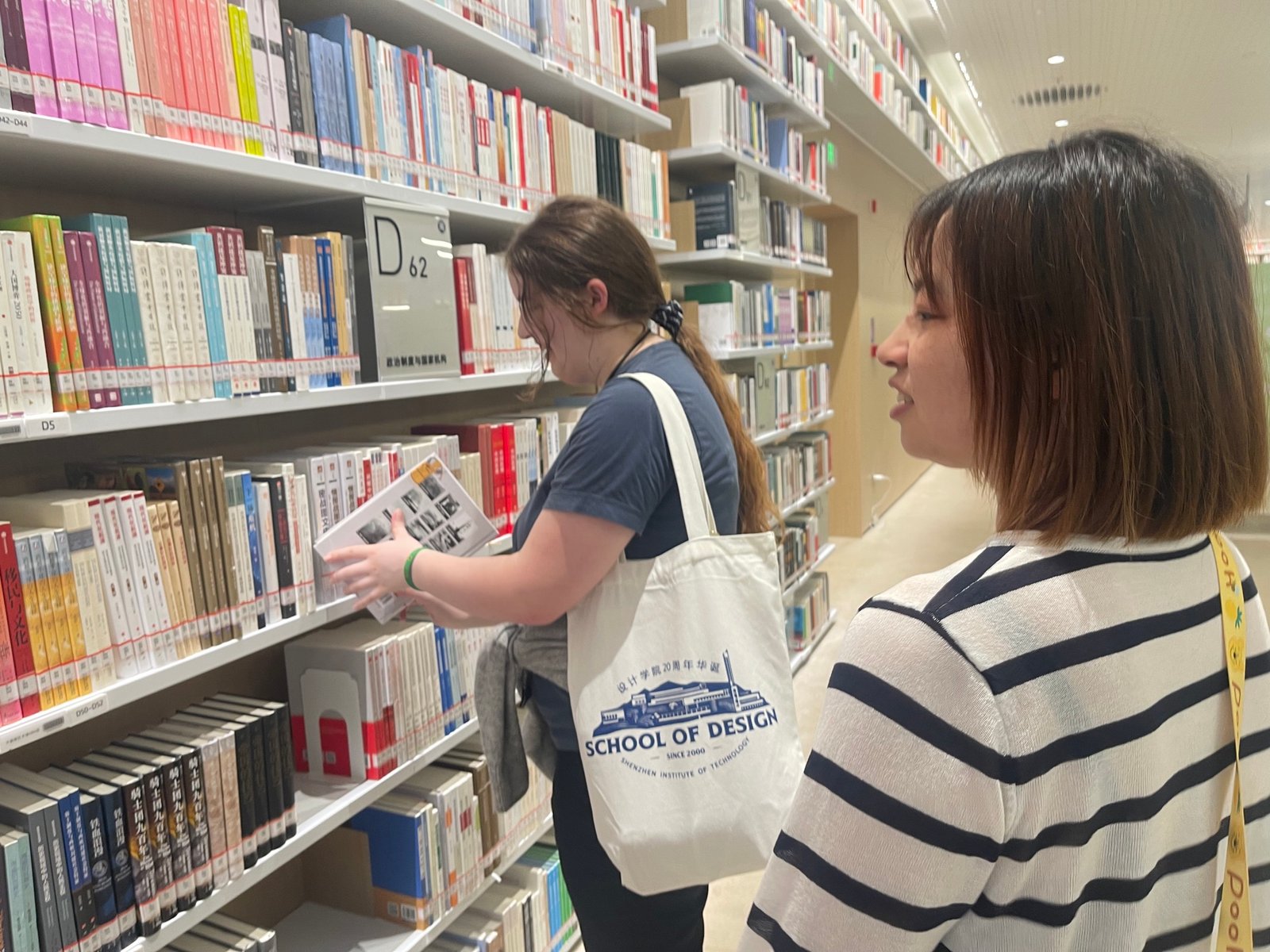
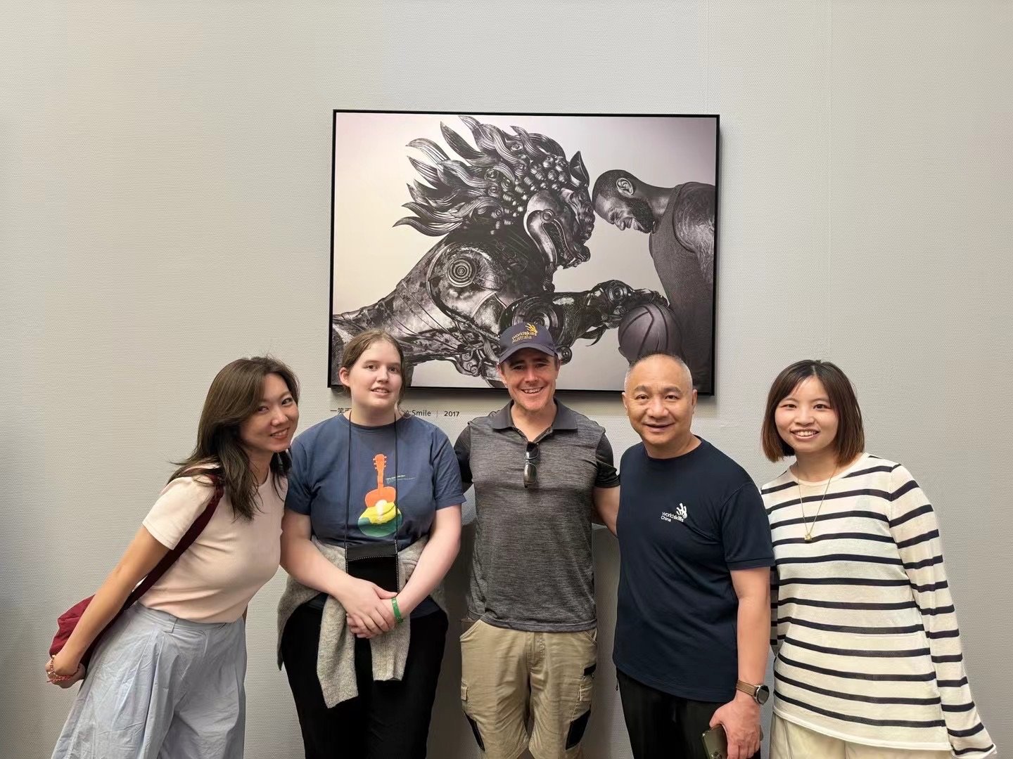
Photos documenting our first tour of the amazing School of Design at Shenzhen Institute of Technology (now converting into a Polytechnic) are below. Wilson was an incredibly generous host. Awe inspiring with what he has achieved and built within such a short time (24 years) from a TAFE NSW model.
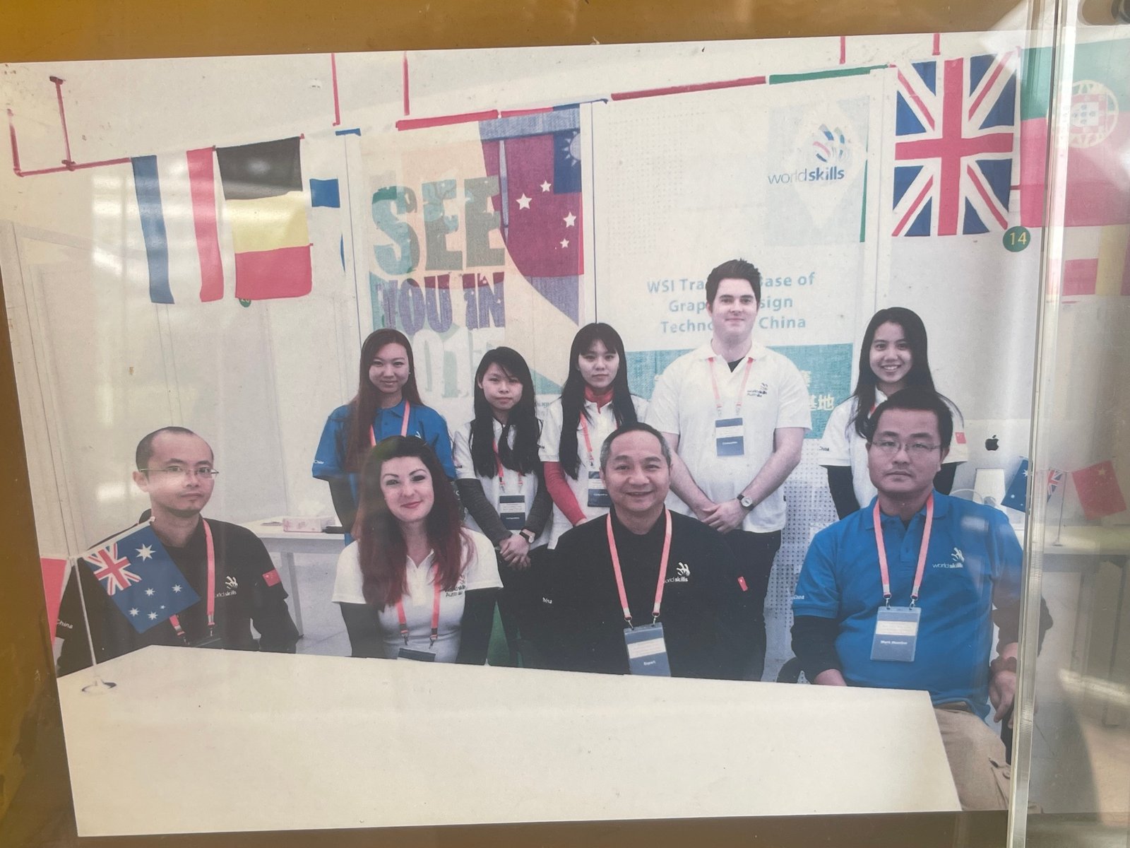
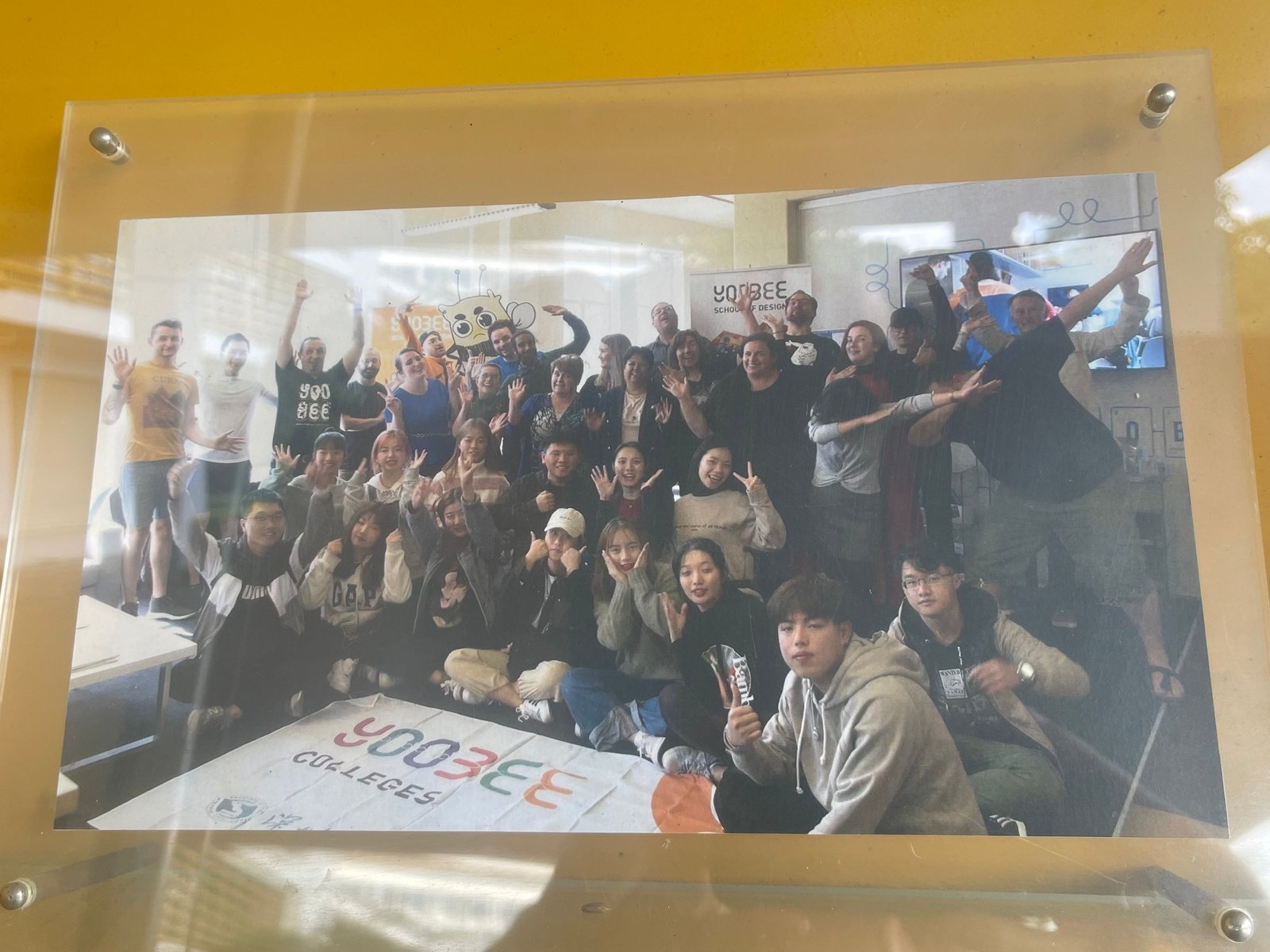
It was so special to see Sarah, Dale, Andre, Olga, Wolfgang, Sherein and others in these old Worldskills international photos. A time capsule of memorabilia at the core of this dedicated Worldskills training facility — it truly is second to none.
DOING WORLDSKILLS RIGHT
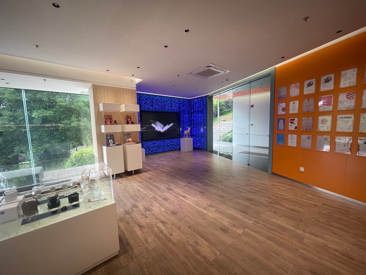
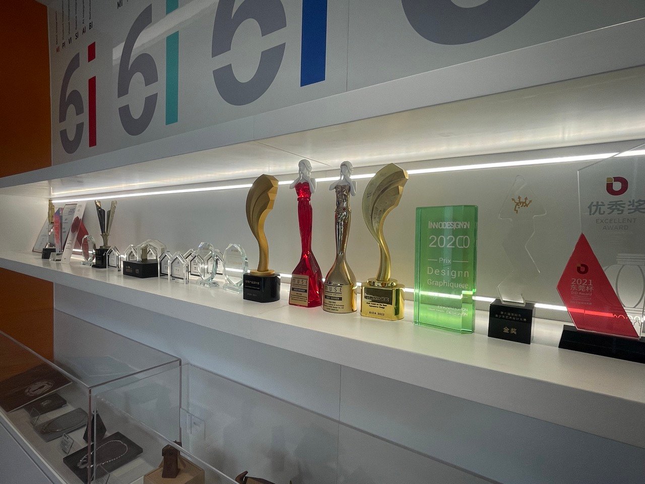
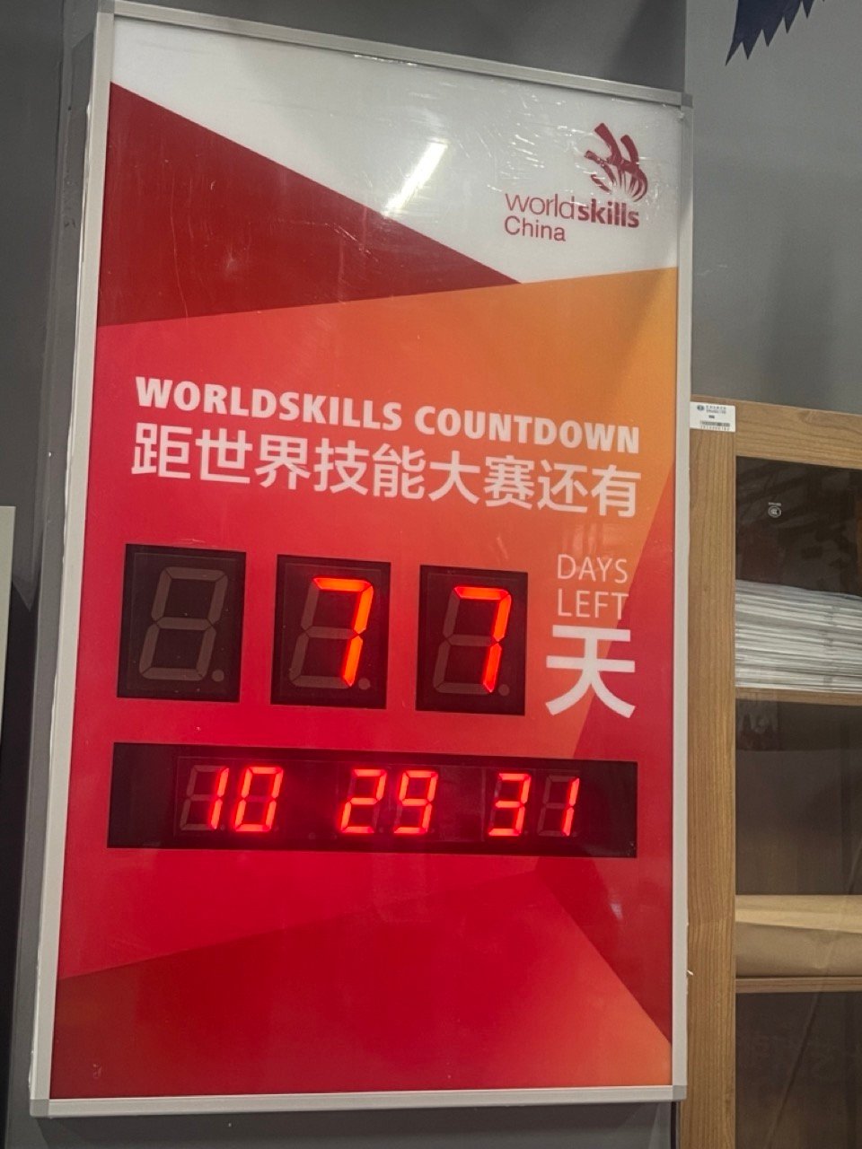
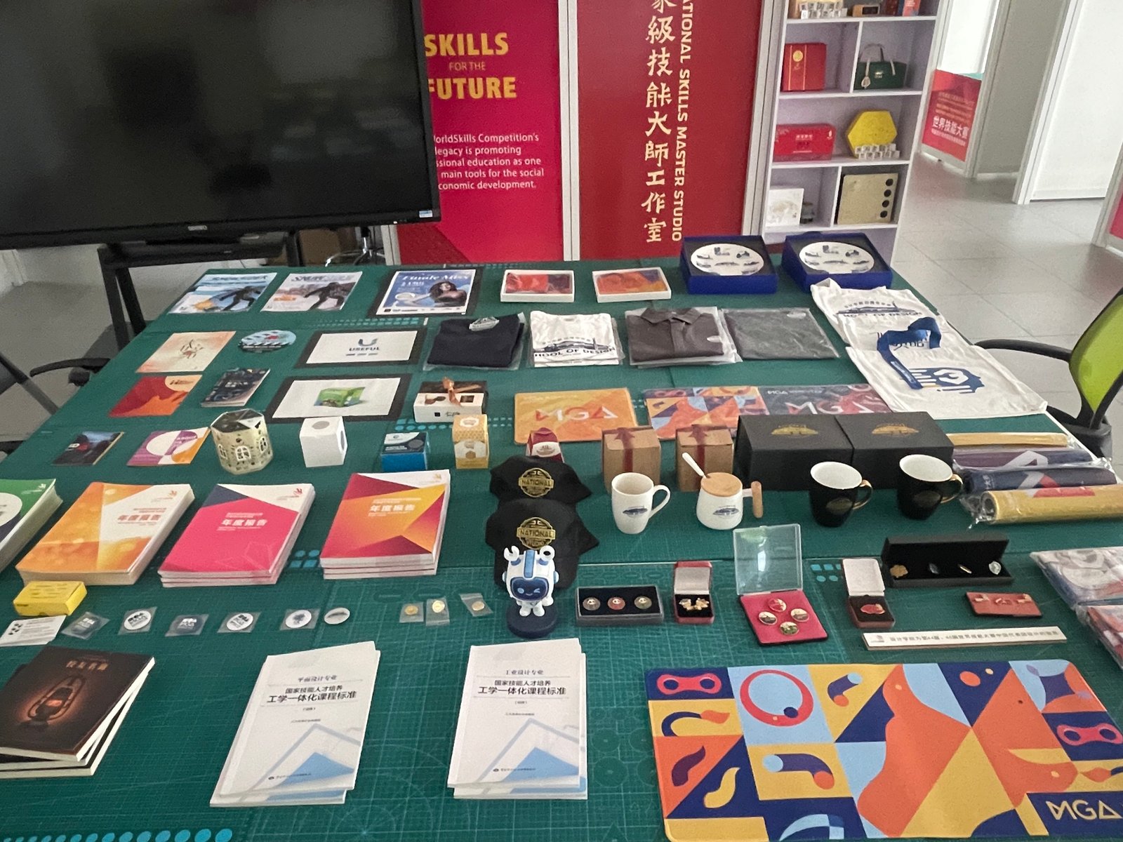
Easily one of the best equipped WorldSkills training facilities I have ever see, coupled with the celebration of past competitors, detailed photo books in an annual reports style. Medals, awards, mockups and examples everywhere and decades of WorldSkills memorabilia proudly displayed. Wilson champions the idea of WorldSkills and incorporates it seamlessly throughout Shenzhen’s world-class facilities.
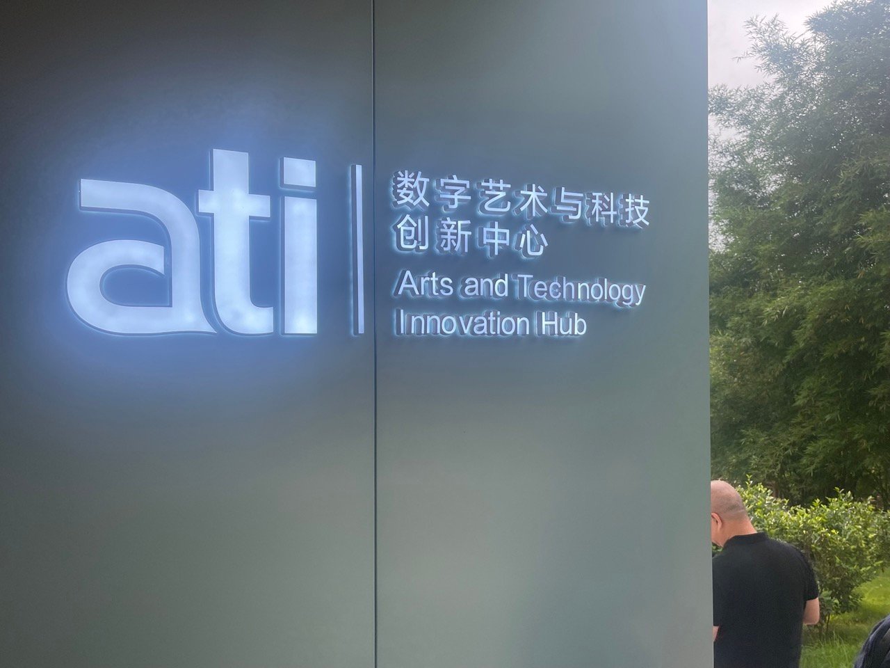
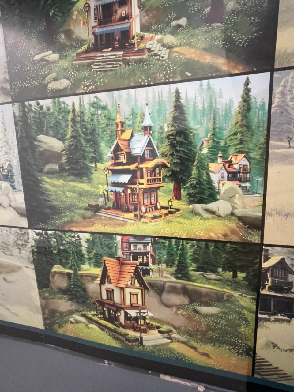
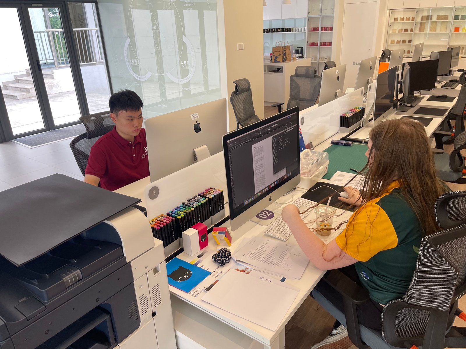
A rich, and fertile ground to showcase the best competitors, but also a confidence in the competitor training process. Facilities that simulate the workplace (case in point is the outstanding ‘ati’ building — ART & TECHNOLOGY INNOVATION HUB as the primary example), but the homely layout, soft furniture and equipment in the 3D Game Art facility also felt like a time you could easily spend hours training and learning in. There was more to explore at https://www.ssti.net.cn/
C1 — PACKAGING
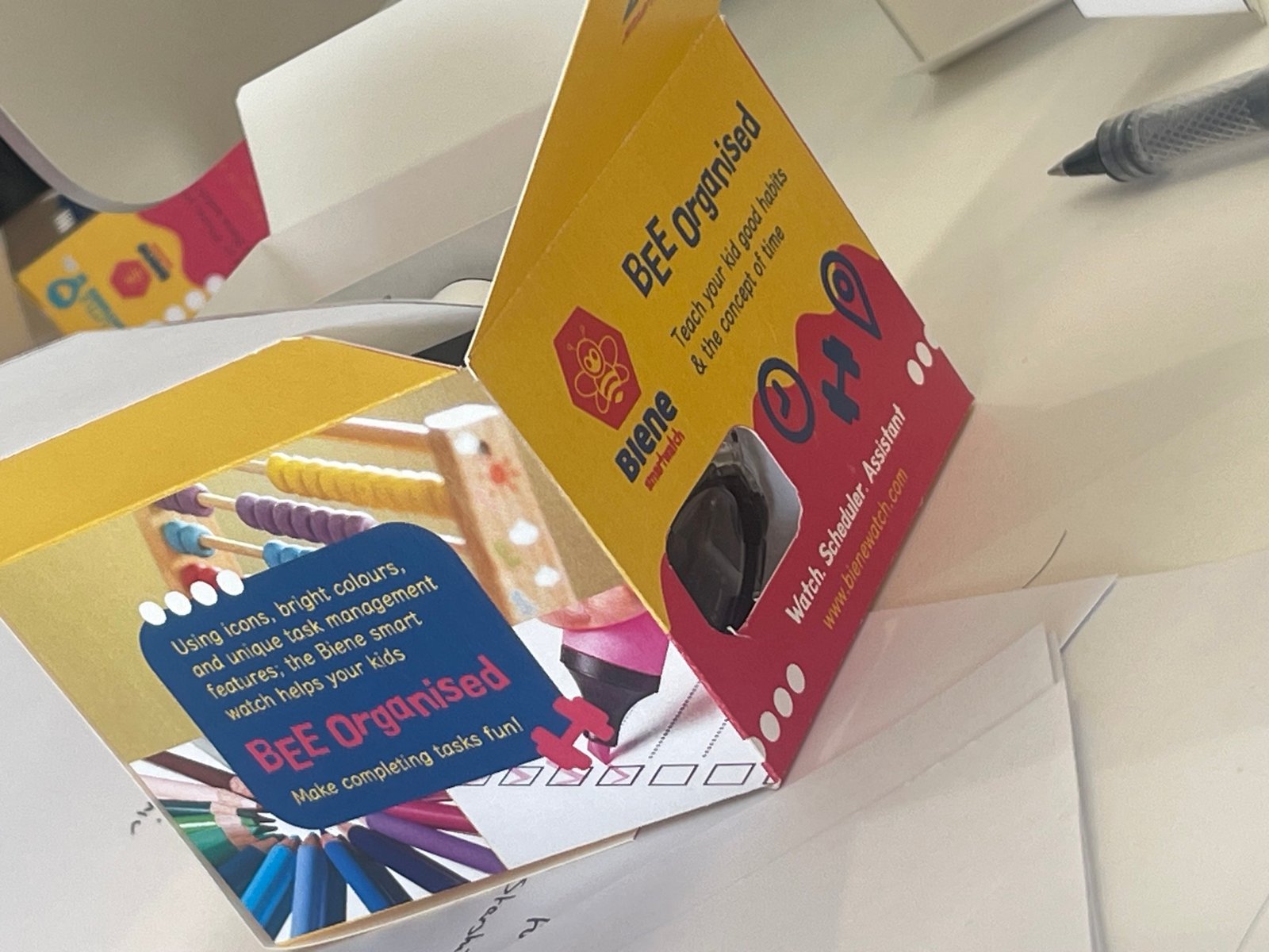
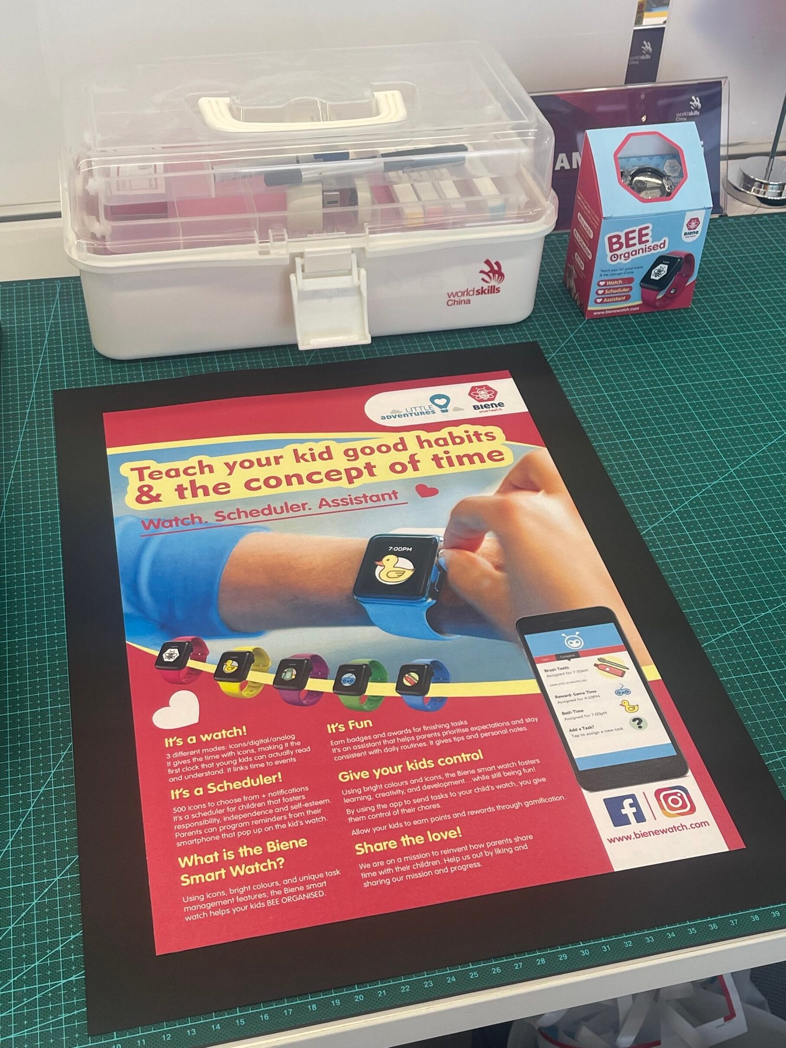
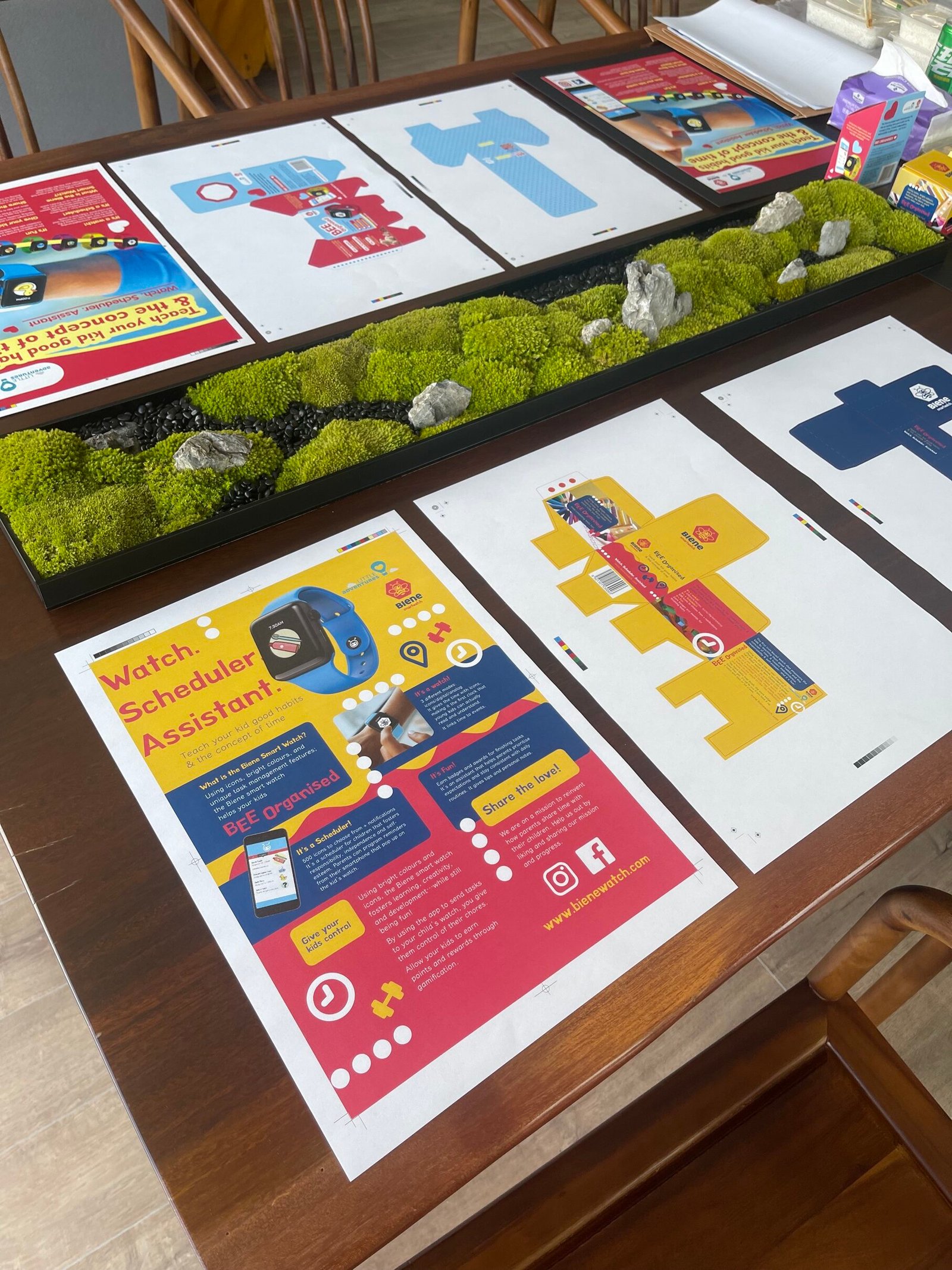
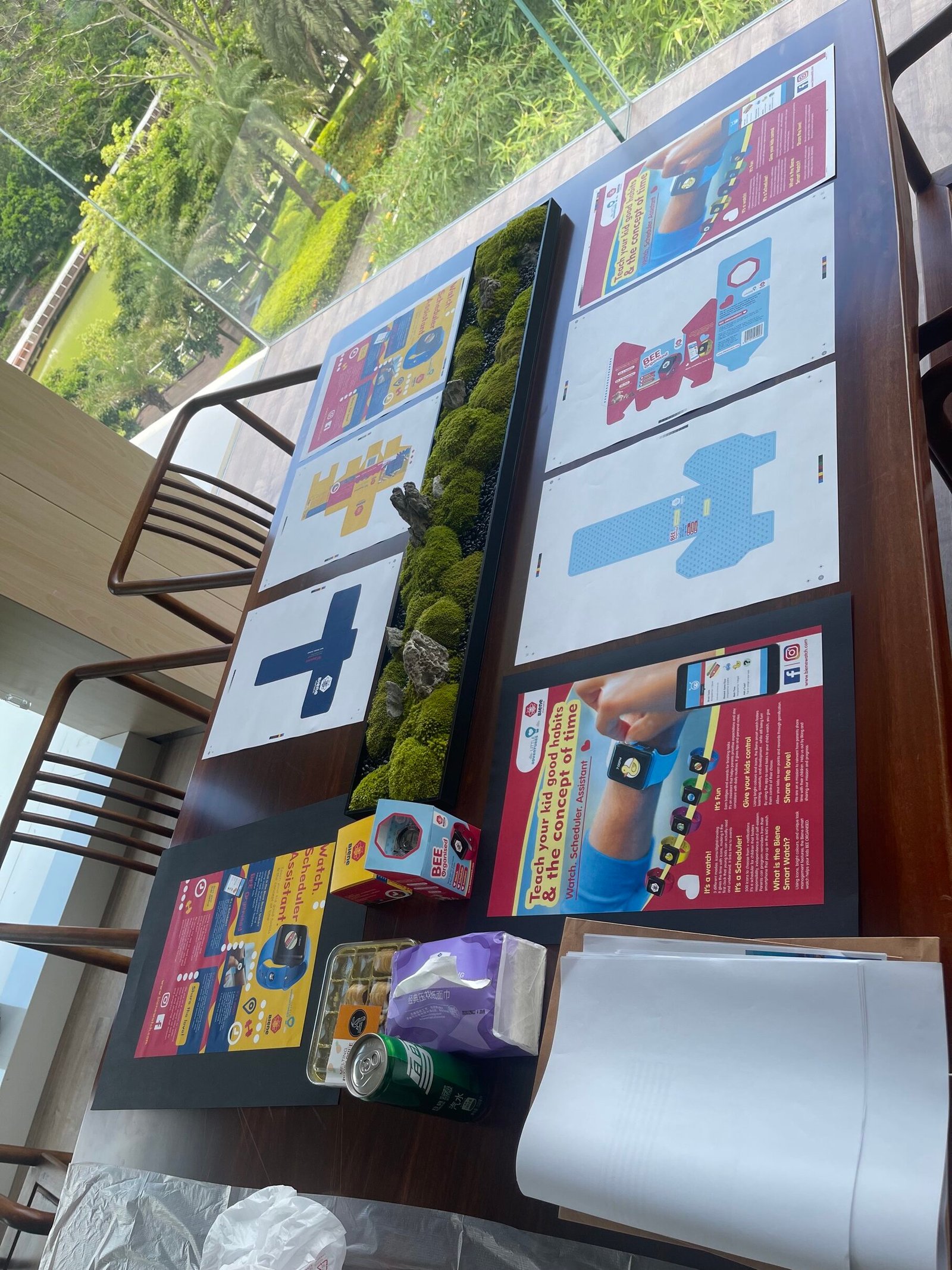
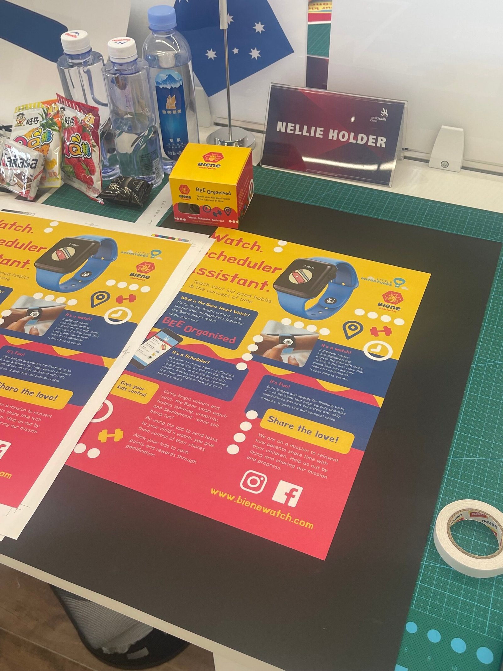
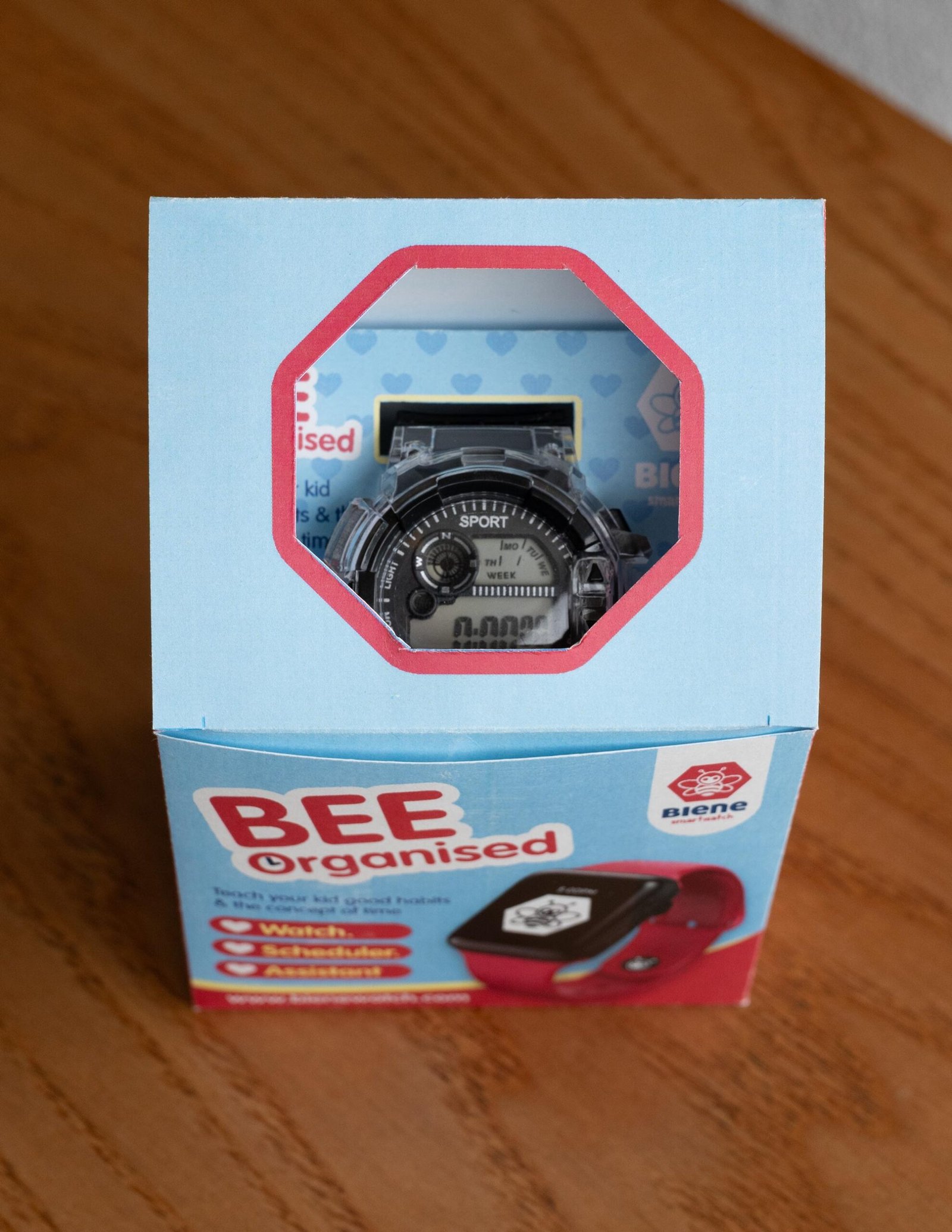
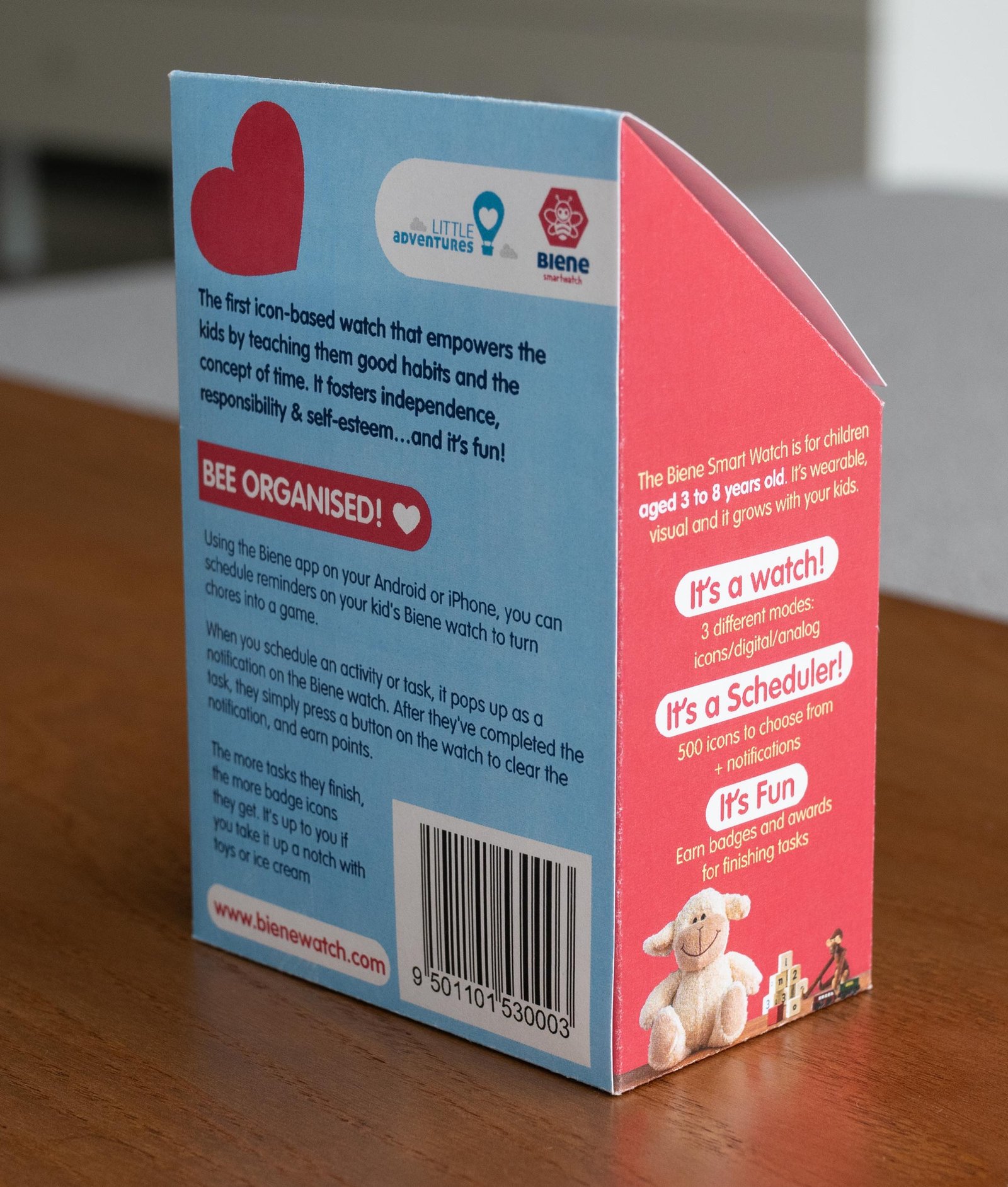
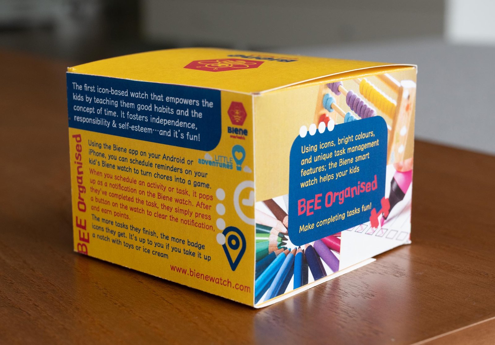
A big shout out to former Aussie Skillaroo, Dale Fisher who originally developed the Biene Smartwatch brief for the Sydney Nationals. Lovely to see how wearable tech has become ubiquitous and how 2024 competitors responded to this kids scheduler and assistant. Remember, it still had to be FUN for kids, but it is the parents who purchase!
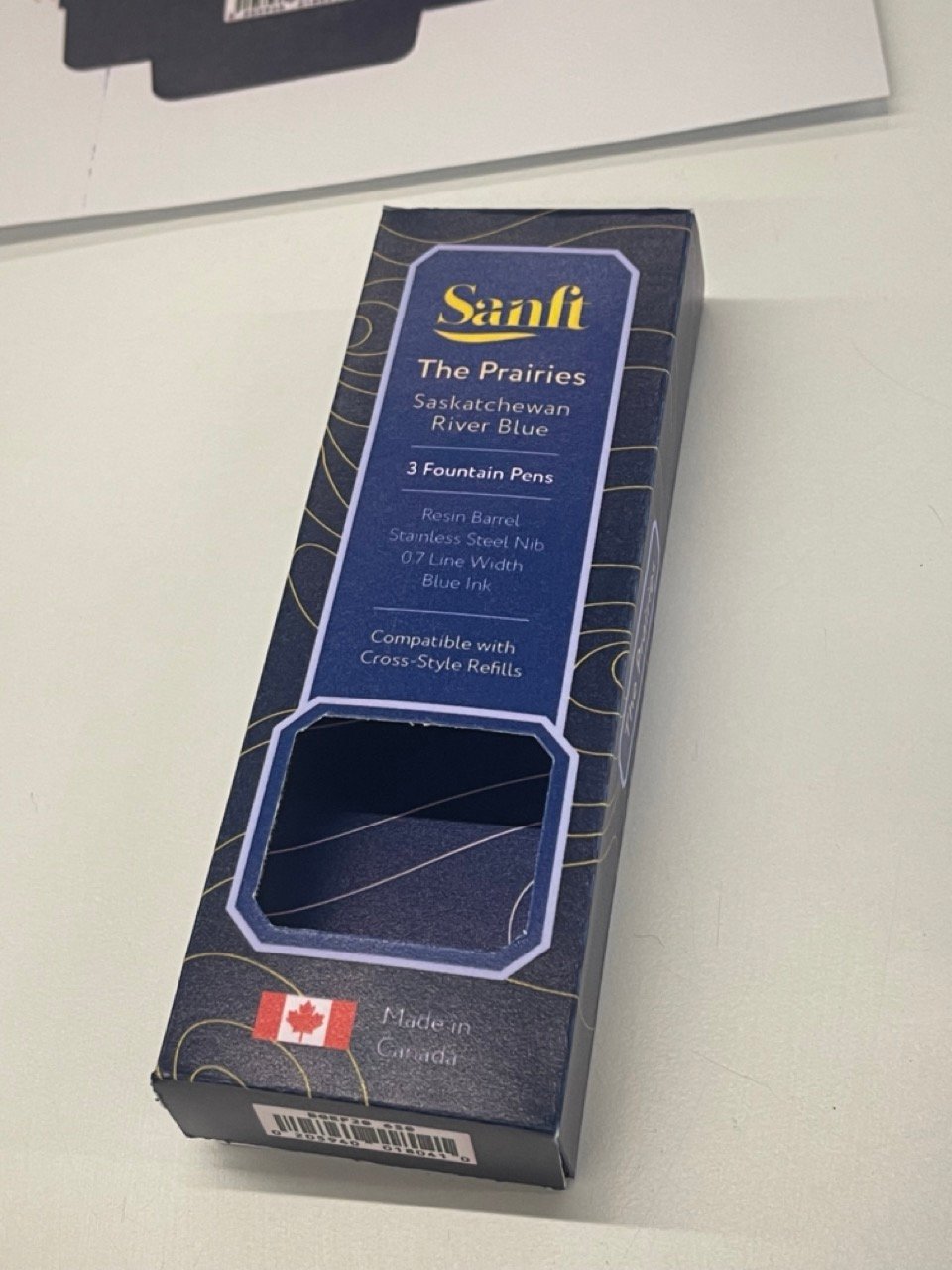
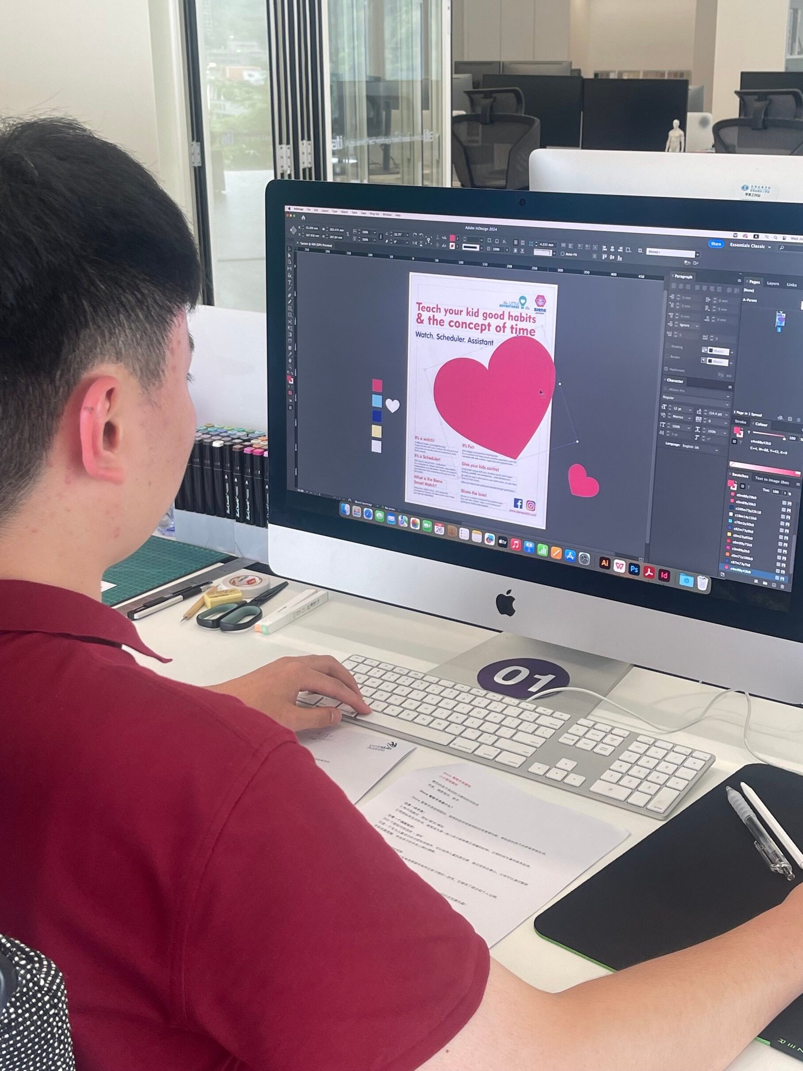
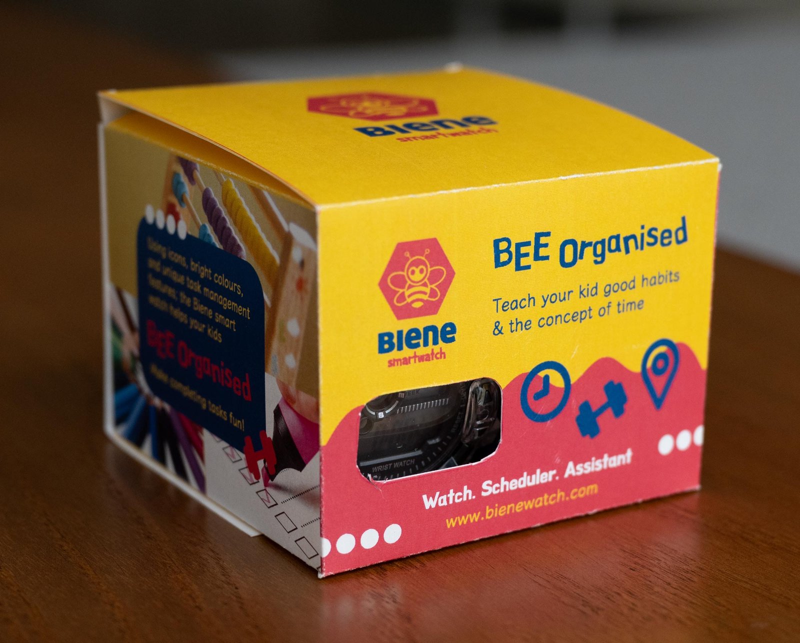
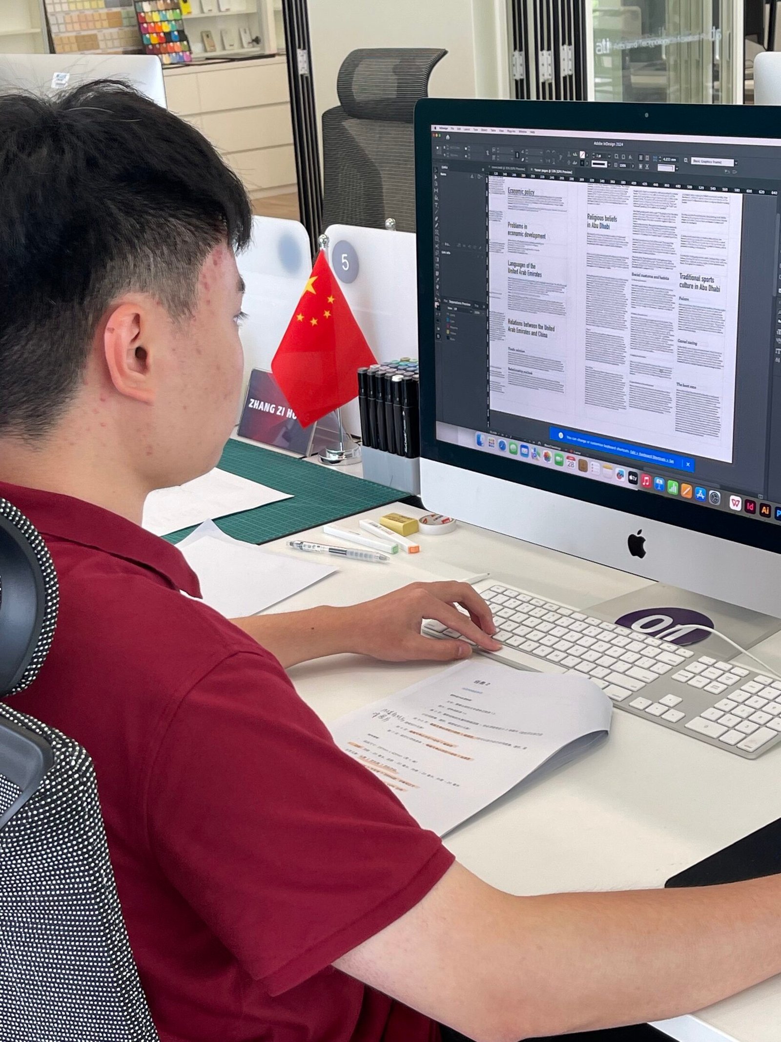
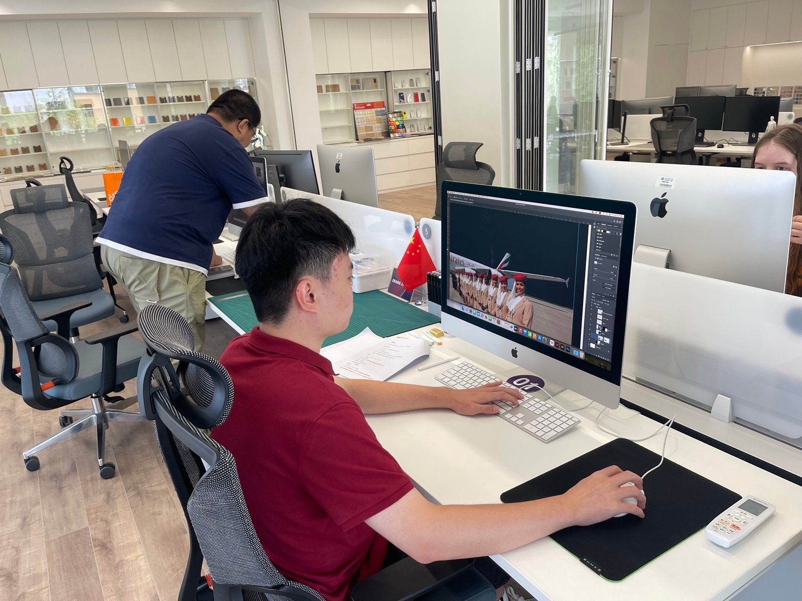
From the very start, Chinese competitor, Zhang Zi Hong, displayed excellent refinement, had a good grasp of English when typesetting (as an additional language!) and a level of calm that was a pleasure to watch. Moved well. Never any fuss. Was organised in a systematic but restrained way, developed a lovely tall angled lid (with window) which was well engineered with solid holding sleeve, and designed a sweeping device to showcase this product range on his promotional poster.
Nellie too was settled, and maintained good paced – finished all tasks, remained un-flustered, and stuck to an achievable schedule throughout.
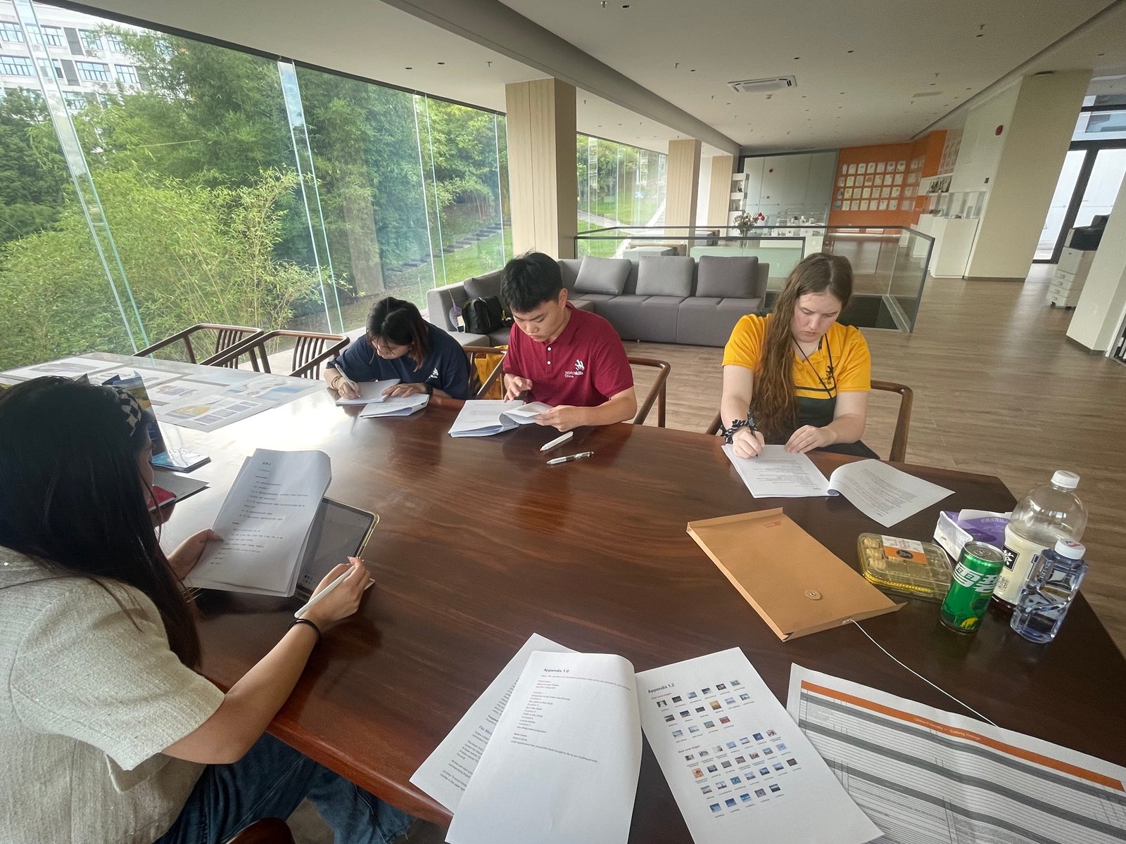
Some notes to self as today unfolded:
-
- Scale.
Naturally, judges like to see harmonious and balanced layout, but that typically comes from ‘at a glance’ clear use of scale. It shouldn’t feel too busy, but compartmentalisation and a clear heading vs hero product is vital here. - Consistency.
China solved the front of box really well. It is simply delightful. However, the point of sale poster lost this clarity. A valuable lesson here. - Be Bold.
The emphasis used by China in the panel text to ‘highlight’ the target audience age range was a master-stroke. Likewise, his window device and angled top ‘almost’ nailed the best way to position the product — with a full glimpse at the smart watch face. Lovely double wall and inlay holding the wrist band too. Way to go Zhang.
- Scale.
C2 — ADVERTISING WITH_WA
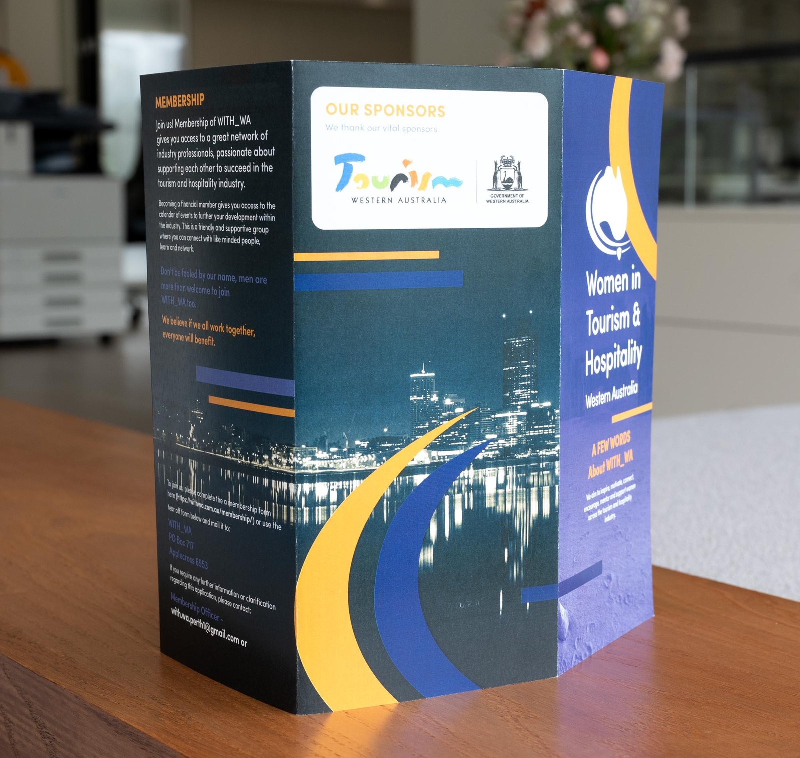
Maiden voyage of an unused four task, real-world test project from 2022 Perth Nationals.
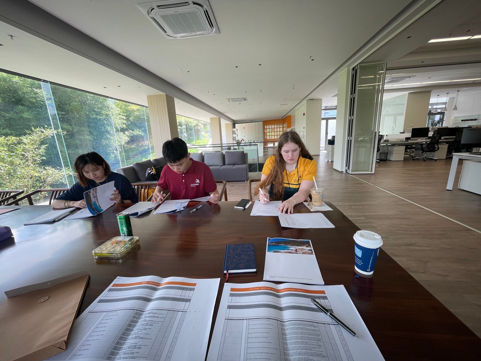
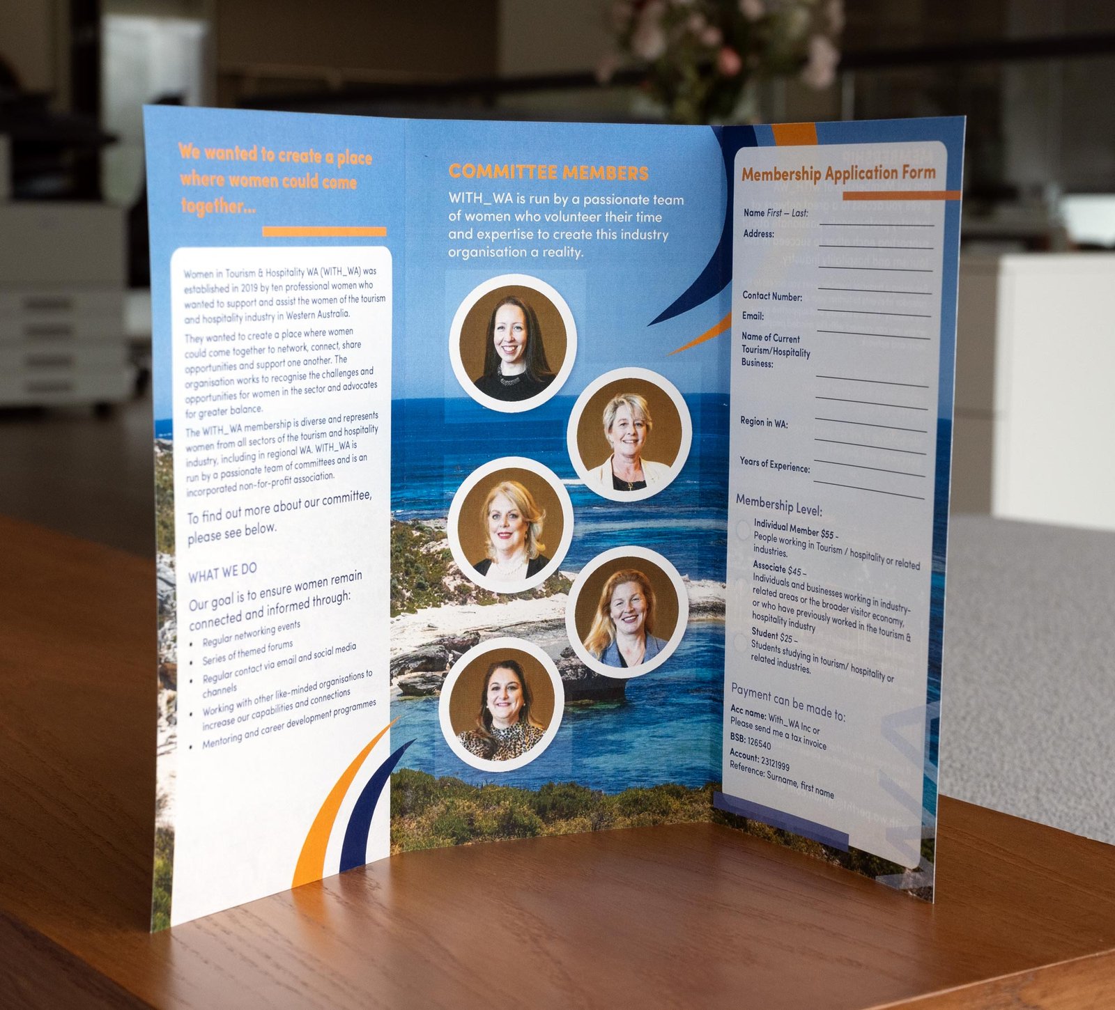
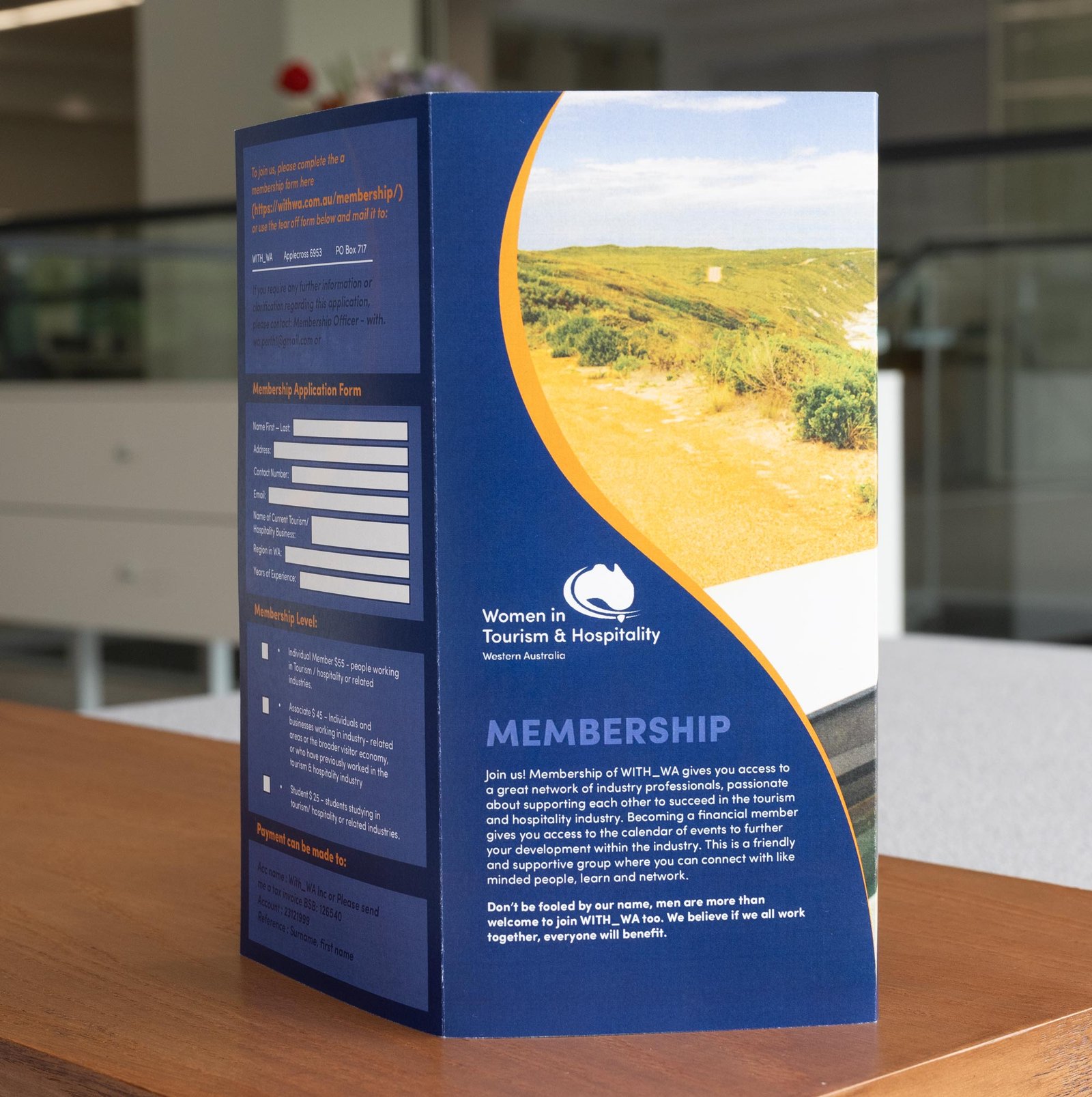
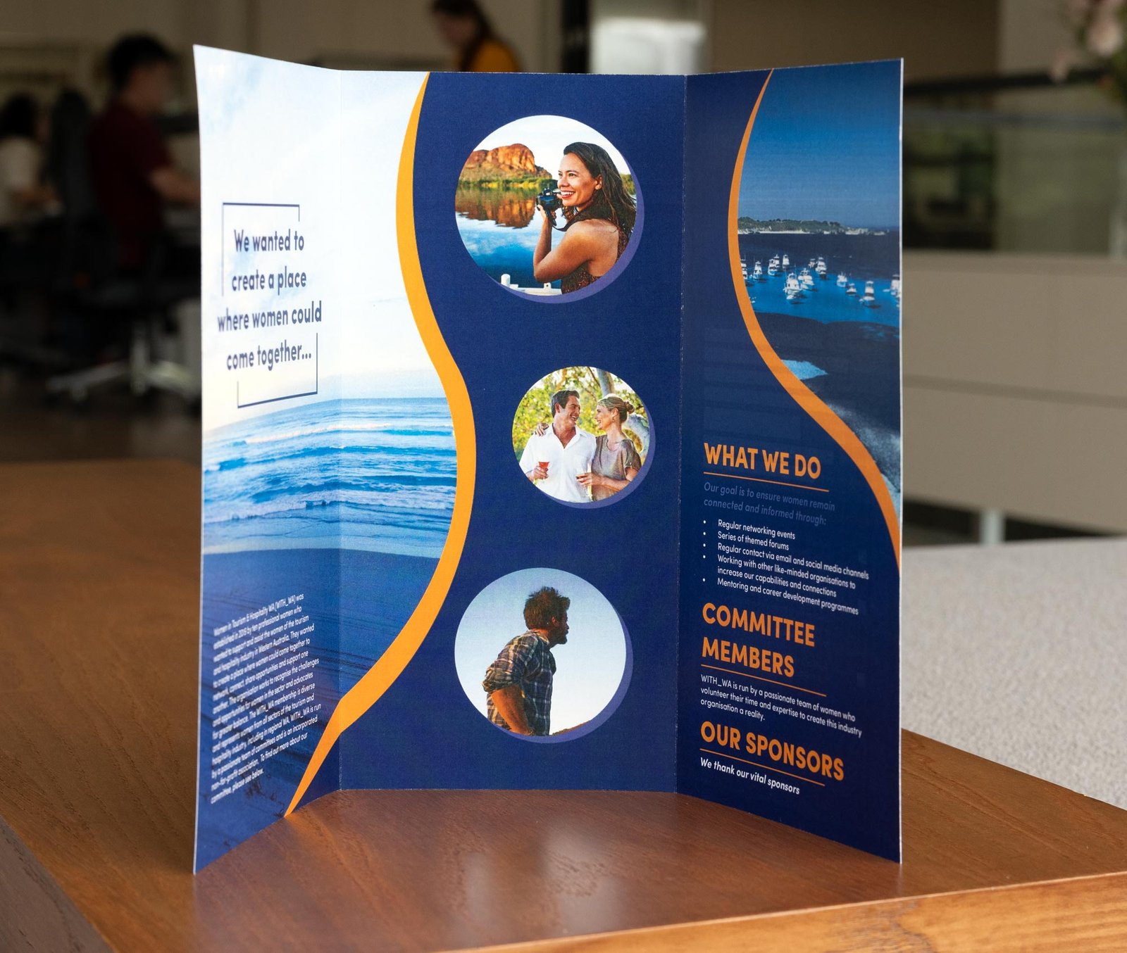
Developed off an amazing rebranding by past National competitor Kelsey Wade, WOMEN IN TOURISM AND HOSPITALITY WA sought to roll out a range of membership promotional material and whilst this brief has never been tested, it proved a great chance for Nellie and Zhang to run through a larger, four task project on Day 02.
Some notes to self as today unfolded:
-
- A picture tells a 1000 words.
With a full appendix of Western Australian imagery to select from, it was vital to select, crop and choose imagery that painted WA in the best light. Likewise headshot photography of the committee had to feature prominently and both competitors had to remain inside brand-book constraints. Image selection to allow text to sit on top of full sized photos and choosing the right photos for secondary and textural elements was vital. - Dealing with lots of text on the pull-up banner.
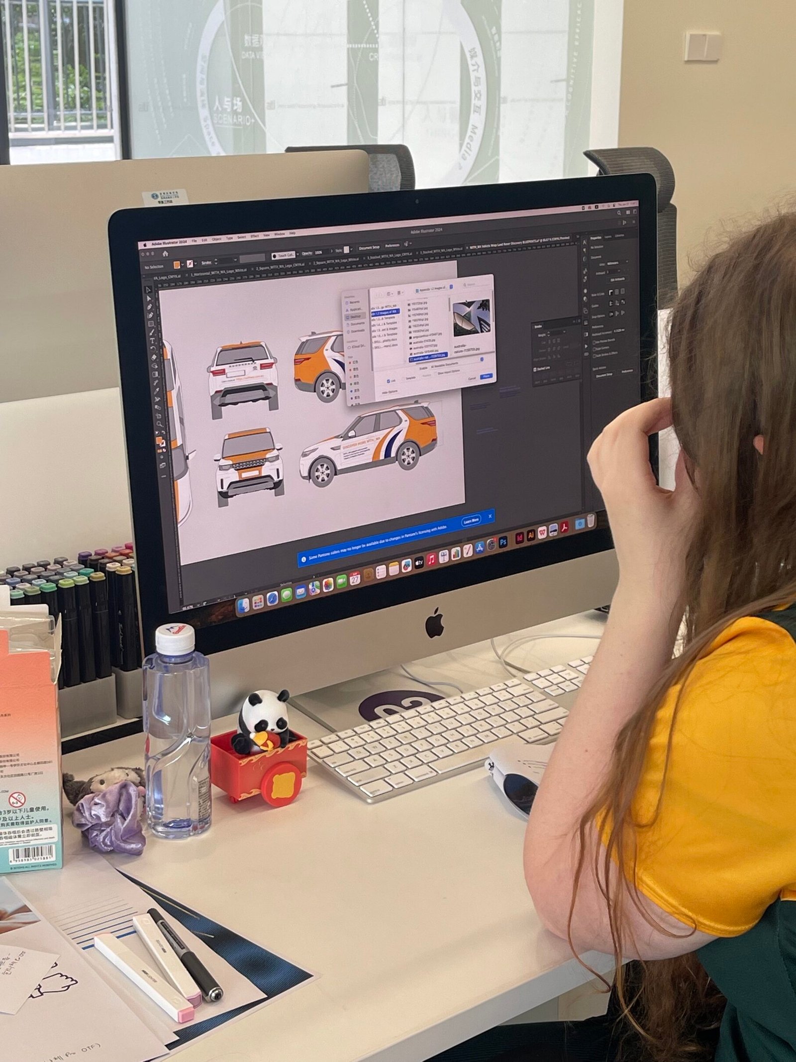
Clients love to say everything, all at once. However, the pull-up banner task also presented a challenge to showcase the new brand, but also communicate from a distance. So, scale and hierarchy (as mentioned above) once again became vital, especially with several images required to help colourise and decorate these important ‘backdrops’ for photos and directional event way-finding. - Car Wraps with an unlimited budget.
Cars move fast, so striking livery helps build brand prestige and in this case, substitute as a moving billboard as it moves across the vast state of Western Australia. Amazing use of branding colours, impossibly large typography that spills off the side panels, and a logo that can been seen from a helicopter was the order of the day. Both competitors a little too restrained on this task.
- A picture tells a 1000 words.
C3 — EDITORIAL PREVIEW FOR ABU DHABI
Triple translated test project proved difficult to read and provided an illustration loophole.
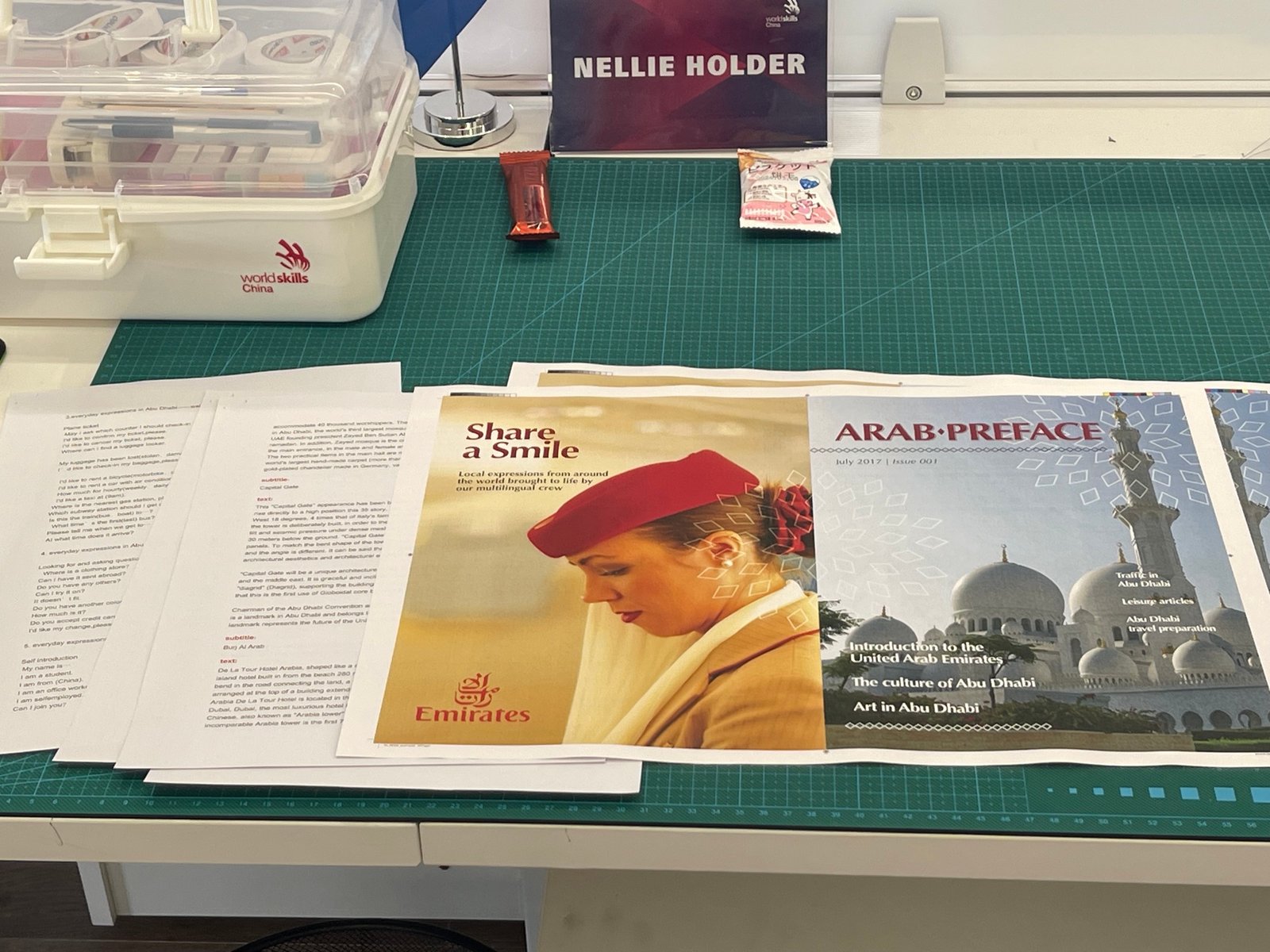
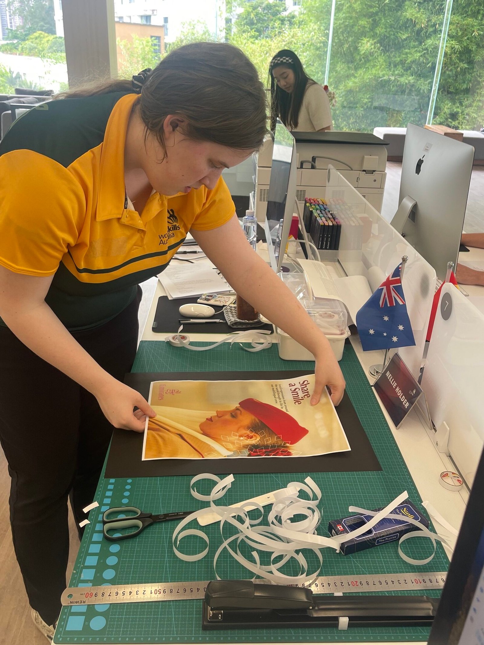
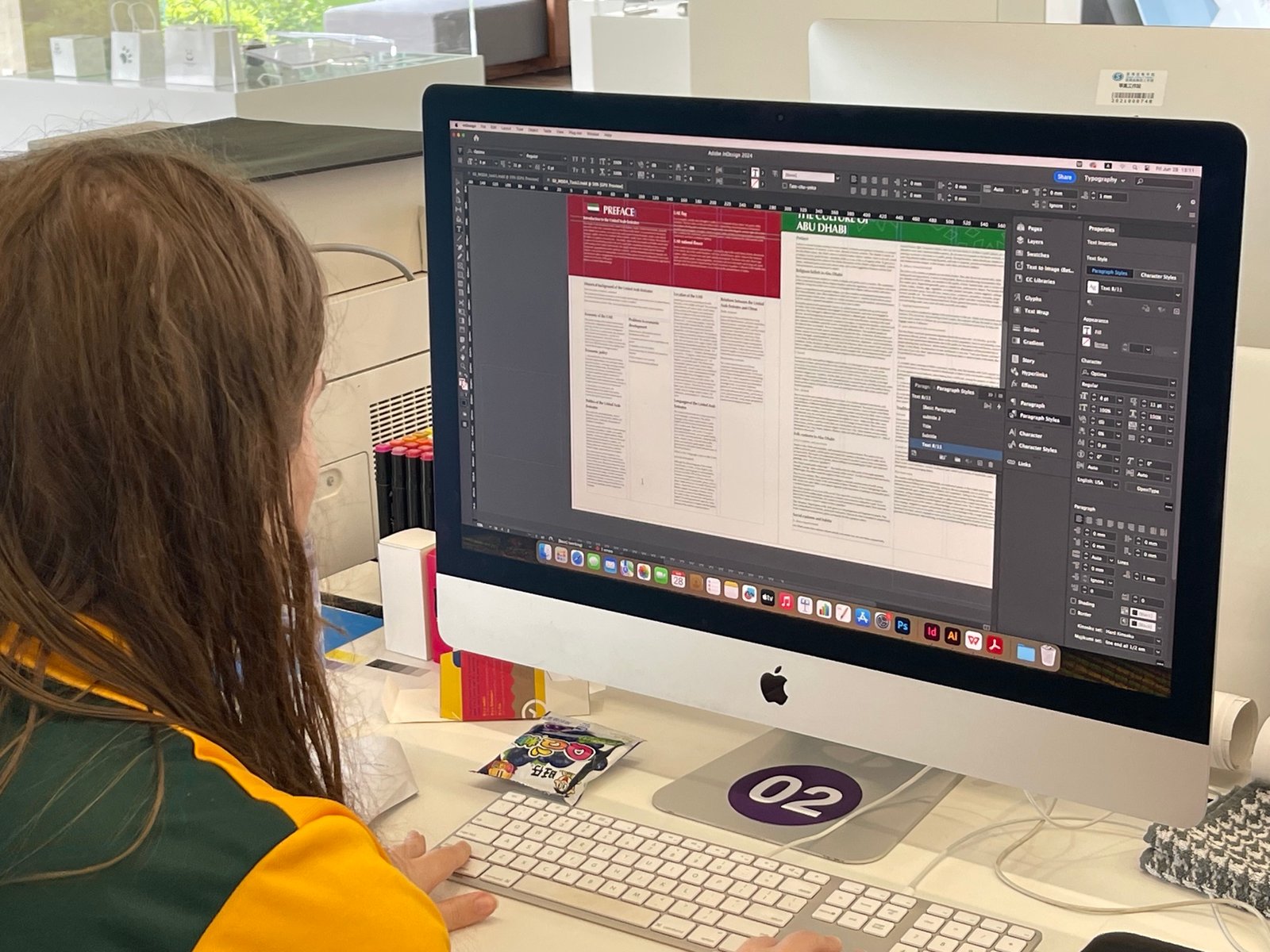
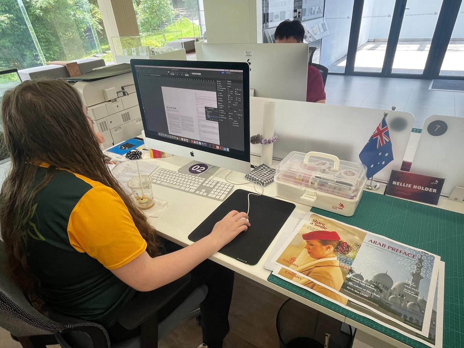
A huge wall of text is always tricky to enliven. Nellie was able to capitalise on a poorly translated component of ‘illustration’ rather than ‘image’ to speed development. Tight columns of text with hairlines and lovely ‘arabic inspired patterning’ helped greatly. Subtle background colouring warmed the page and a new mounting method worked wonders.
Some notes to self as today unfolded:
-
- Two tick method.
Indy swears by the two tick method — tick once when you do it, tick again when you check it. Today this would have gained some page numbering marks easily if this was deployed. Particularly with a foreign brief and an hour shorter than typical days. Lesson learnt! - Dealing with lots of text and using paragraph styles quickly.
Walls of text suck. So if pull quotes and additional text is prohibited, then imagery and pattern (and coloured sections) help make the page more inviting. - More emphasis on photo montage.
A good head ‘break out’ or clever montage collage in photoshop goes a long way. Three or four images combined always communicate more than one scaled and awkwardly cropped (or dull duo-toned).
- Two tick method.
